
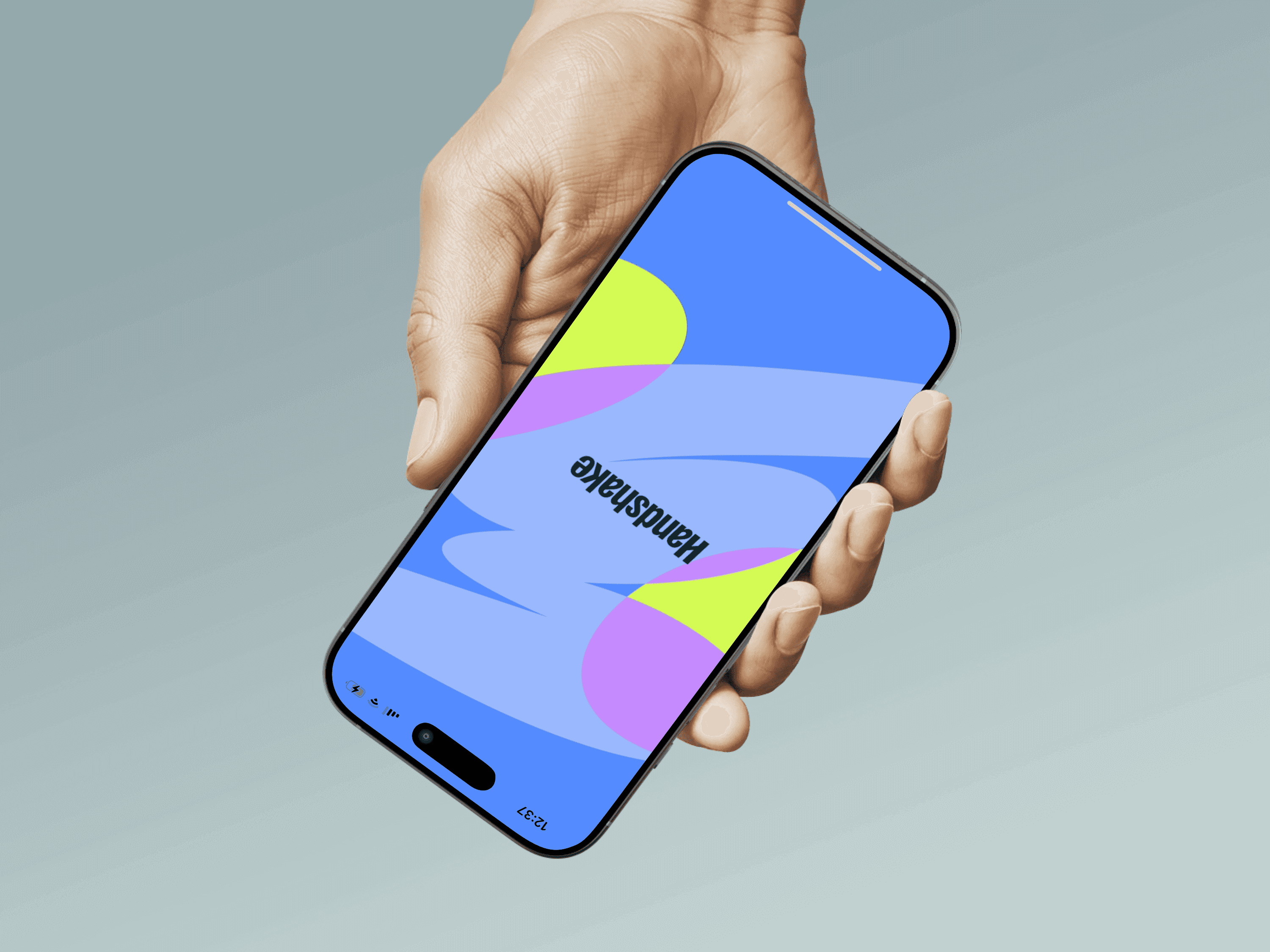
Handshake
Enhancing Student Career Platform Experience
13-week UX Research and Product Design Project
Fall 2024
Handshake is a leading job-search platform connecting university students with internships, job postings, and networking opportunities. Despite its widespread adoption across universities, students consistently report usability issues that hinder effective job searching, including cluttered navigation, irrelevant job recommendations, and limited networking capabilities. This project employed contextual inquiry methodology to identify core user pain points and develop targeted UX improvements that enhance student engagement and job-seeking success.
ROLE
UX Design Researcher, Designer, Analysis, UX Research,Wire framing, Prototyping, Usability testing
CHALLENGE
Bridge the gap between Handshake's intended functionality and actual student user experience
TIME FRAME
13 weeks
METHOD
Contextual Inquiry, Affinity Diagramming, Persona Development, Prototype Testing
TOOLS
Figma, Fig jam, Google Docs, Affinity Mapping, Zoom, Google Forms
COLLABORATORS
Domenica Socola
Manya Thapliyal
Yoonju
Research & Discovery
UNDERSTANDING THE PROBLEM
KEY RESEARCH INSIGHTS
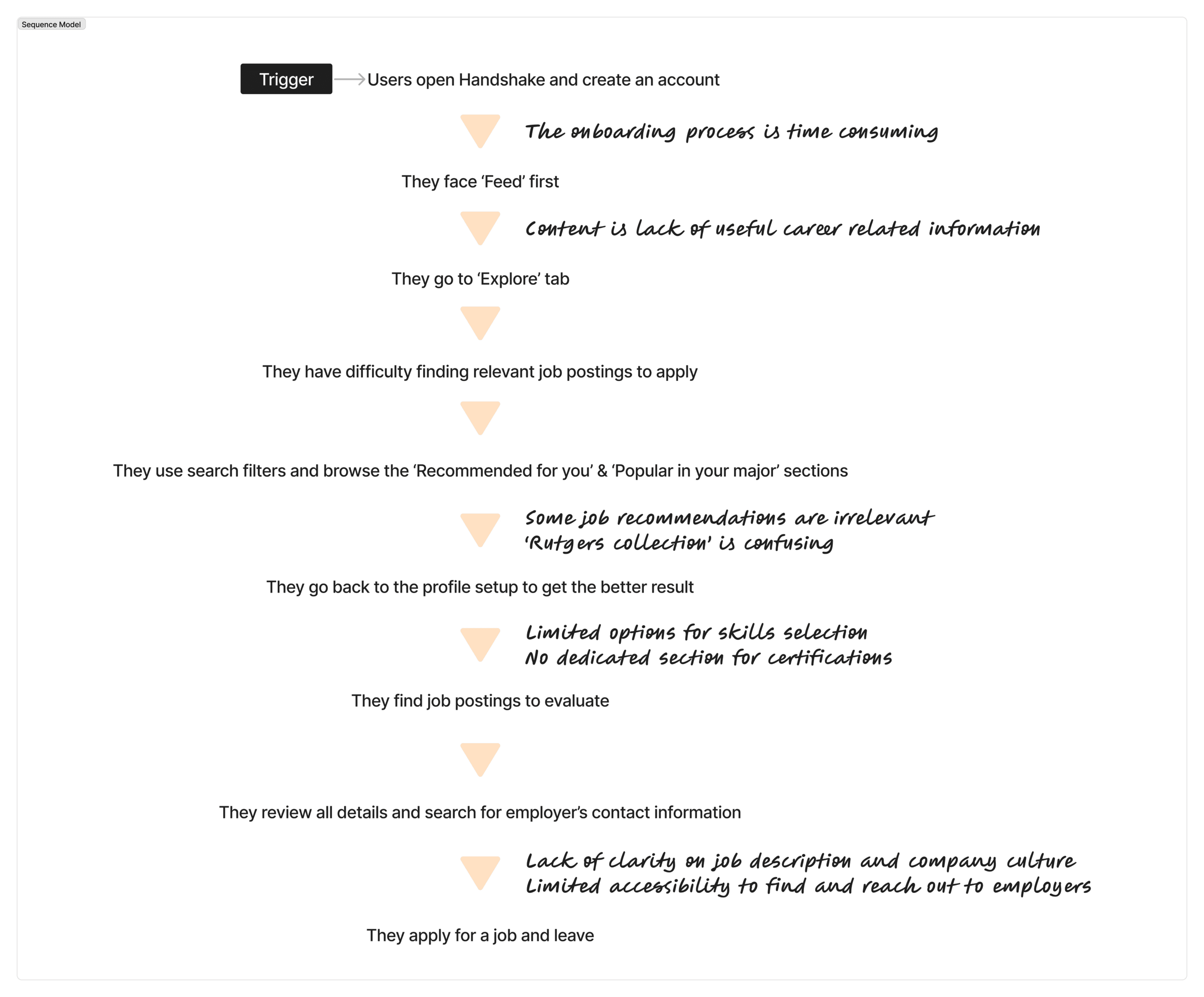
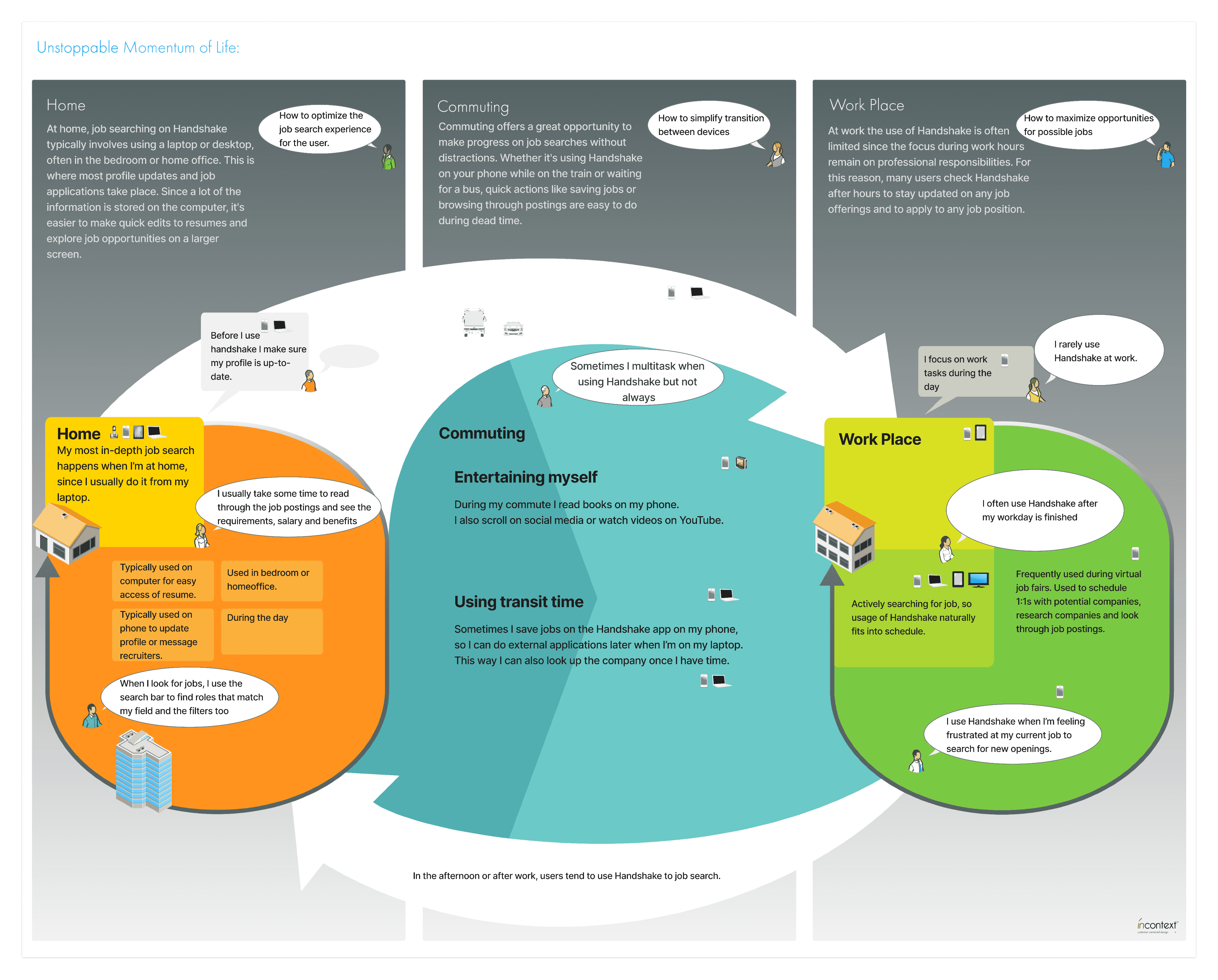
I conducted in-depth contextual interviews with 8 diverse university students and recent graduates, observing them in their natural environments as they navigated Handshake for real job search tasks. This approach revealed authentic user behaviors and pain points that traditional usability testing might miss.
Contextual Inquiry Methodology
Research revealed that while Handshake offers unique university-integrated value, users consistently preferred LinkedIn and Indeed for actual job searching, viewing Handshake as supplementary rather than primary.
Competitive Analysis
Through day-in-the-life modeling, I discovered that students use Handshake in fragmented sessions during brief breaks, requiring optimized mobile experiences and quick-access features.
User Behavior Mapping
"I haven't really reached out to any employer through Handshake. I have done it through LinkedIn, but not Handshake particularly." - Graduate STEM Student
"I see a lot of companies promoting themselves... It helps me get a sense of the work environment, but it also feels a bit like TikTok." - Graduate Humanities Student
Platform Hierarchy Issue
Students use LinkedIn/Indeed as primary platforms, relegating Handshake to university events and career fairs only
Feed Content Misalignment
TikTok-style videos and social media content distract from core job search functionality
Messaging Barriers
Users cannot share portfolio links or job postings, limiting meaningful recruiter engagement
Profile Incompleteness
Cumbersome onboarding process leads to minimal profile completion, reducing job recommendation accuracy
Filter Ineffectiveness
Advanced filtering options frequently malfunction, forcing manual search through irrelevant listings
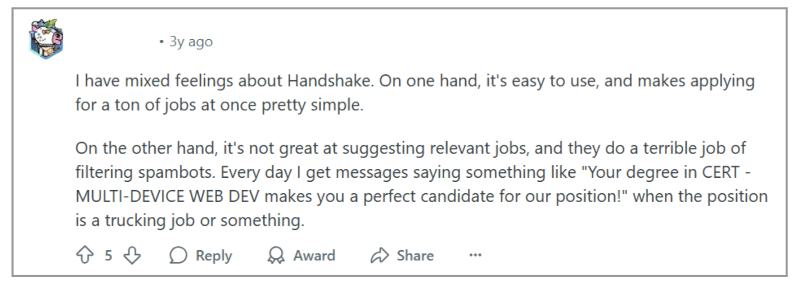
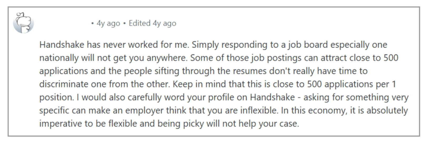
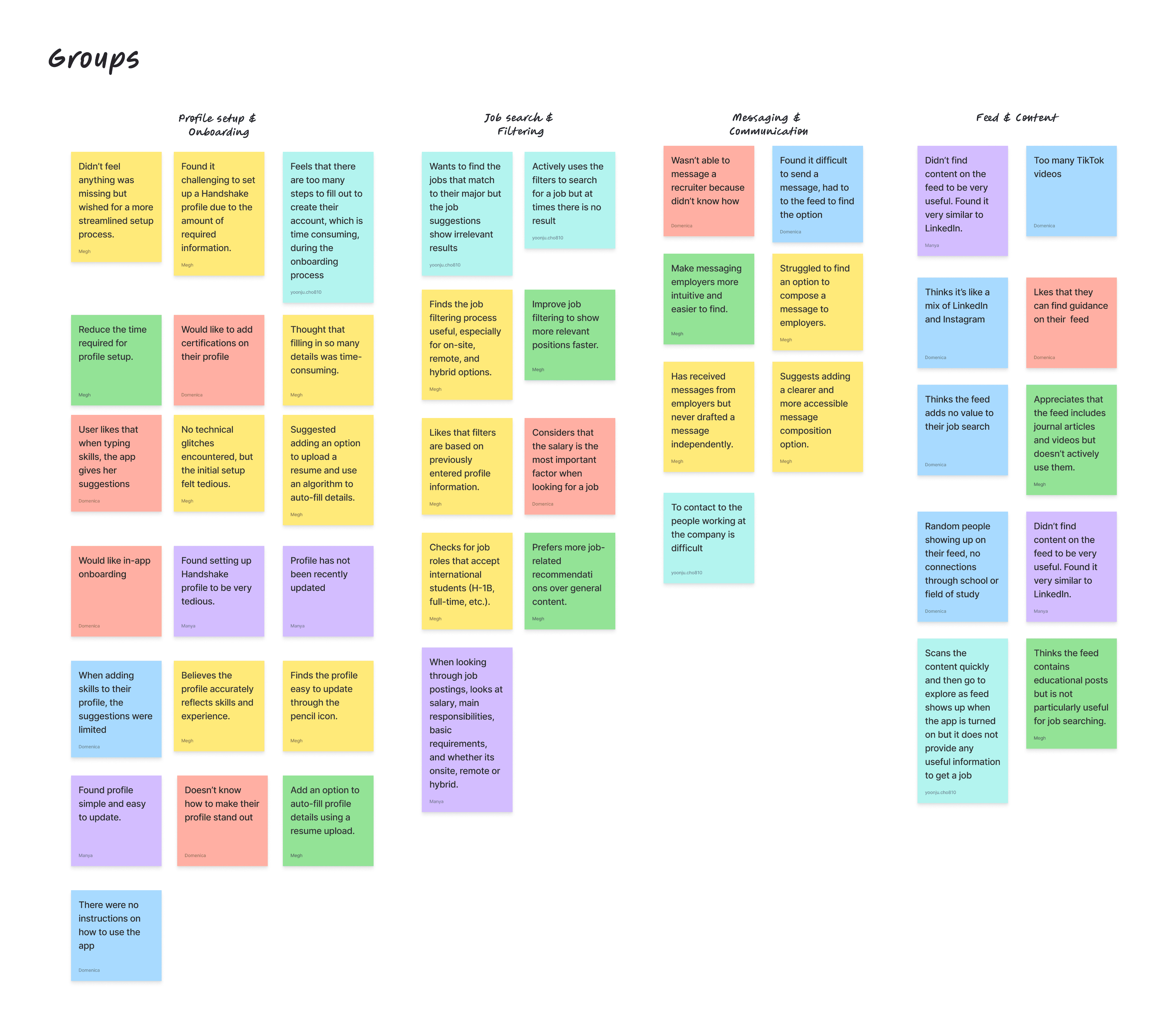
Image 1. Reddit discussion about Handshake App (2022)
Image 2. Reddit discussion about Handshake App (2021)
Discover
Define
Ideate
Design
Testing
Design Process
Ideation &
Concept Development
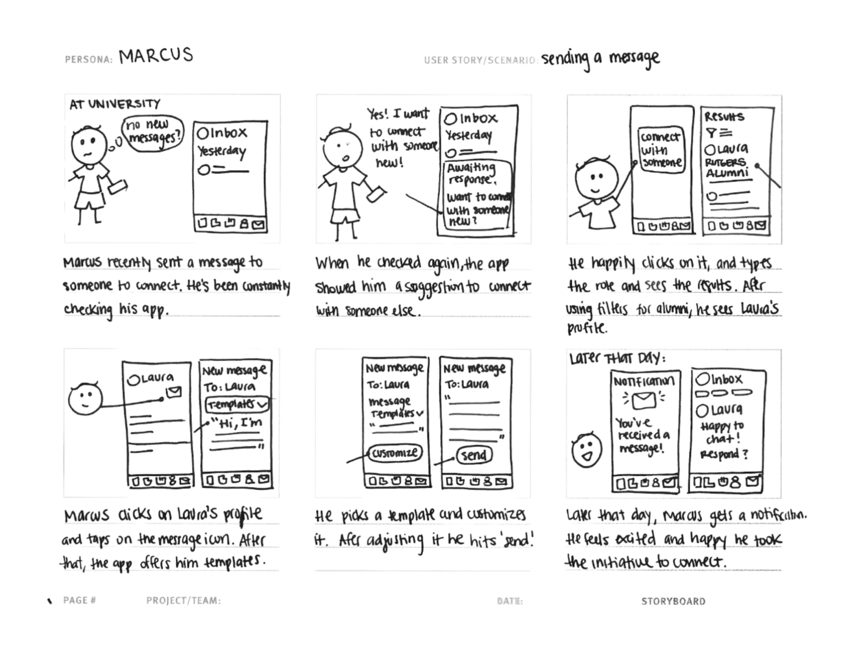
Based on research insights, I developed three primary user personas representing different engagement levels and academic backgrounds: Allison (methodical international student), Marcus (exploration-focused marketer), and Alex (efficiency-driven job seeker). These personas guided design decisions by representing distinct user needs and technological comfort levels.
Wireframe Ideation
Initial sketches

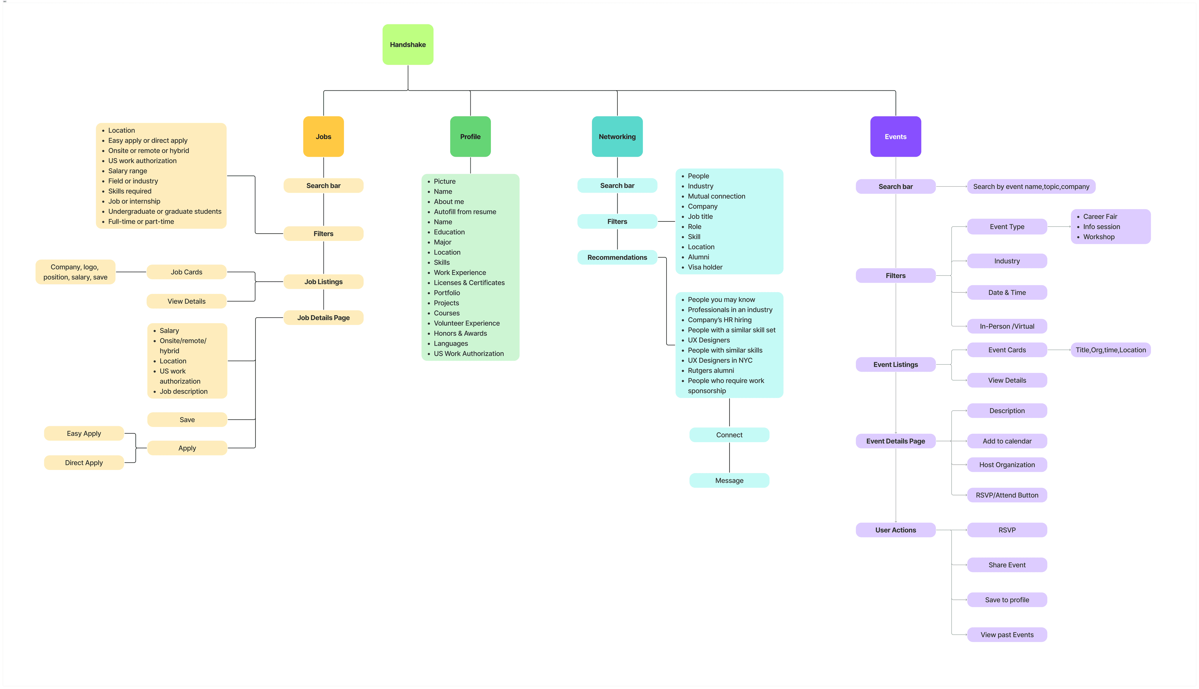
Information Architecture & User Flows
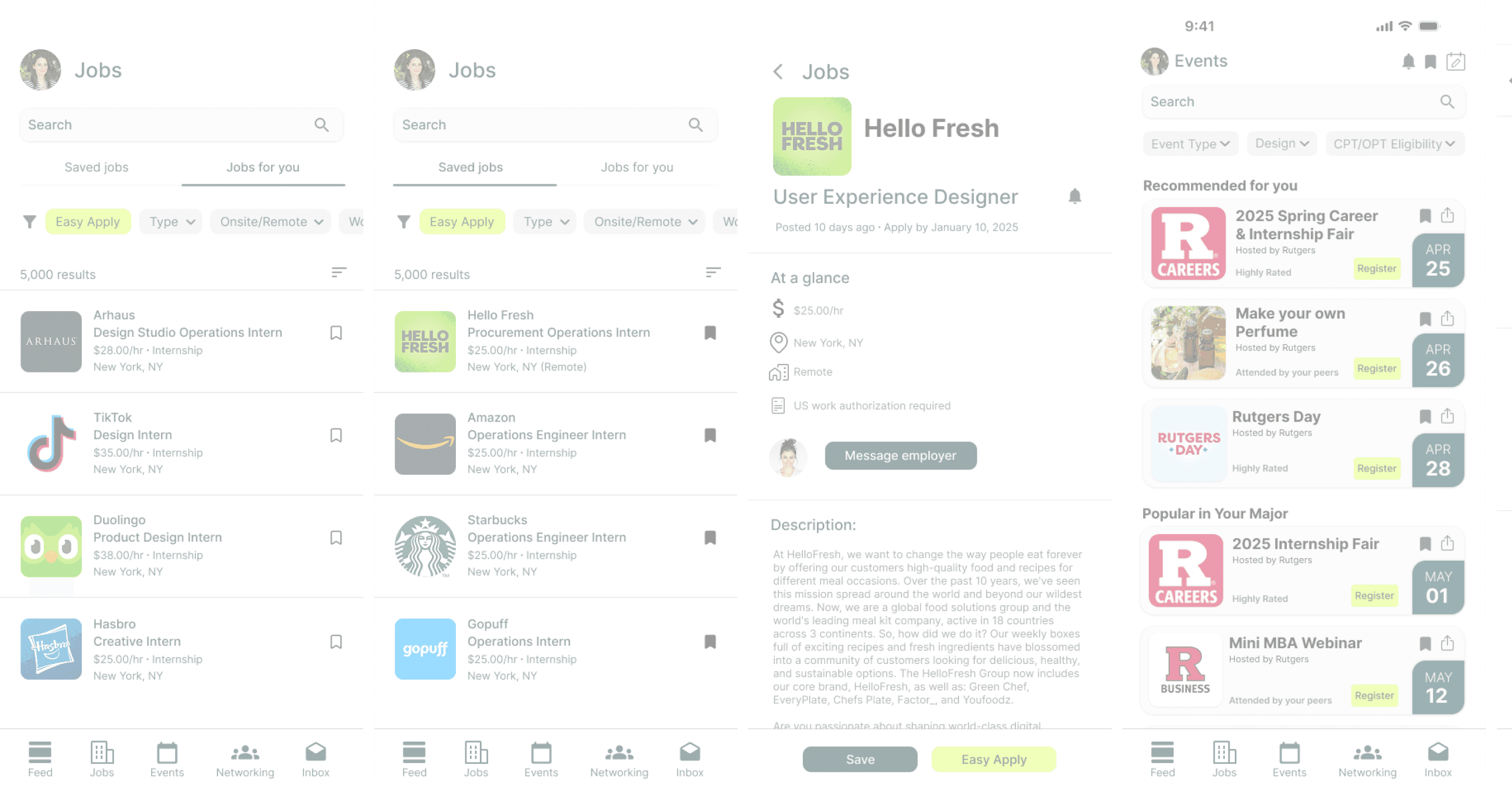
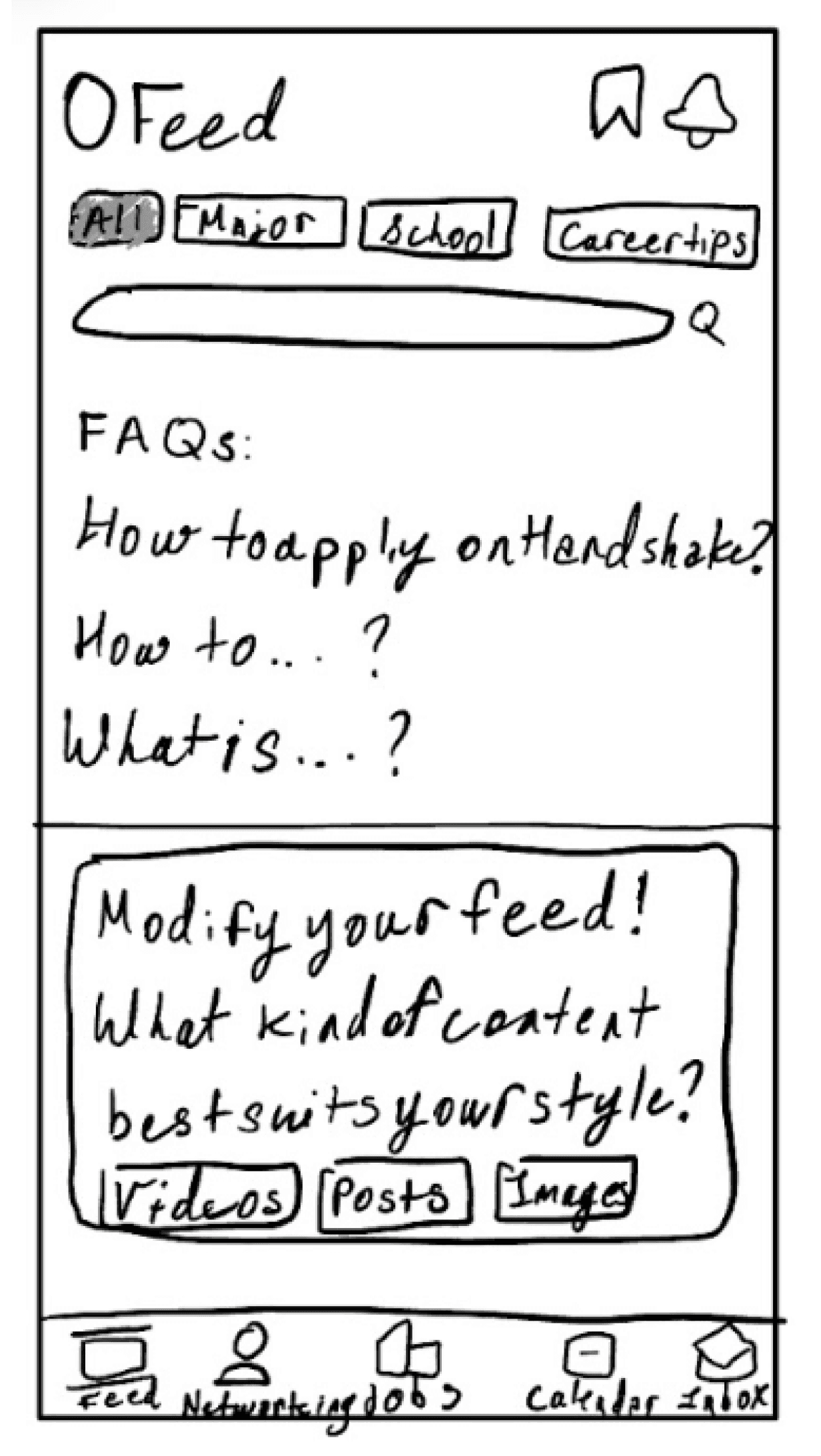
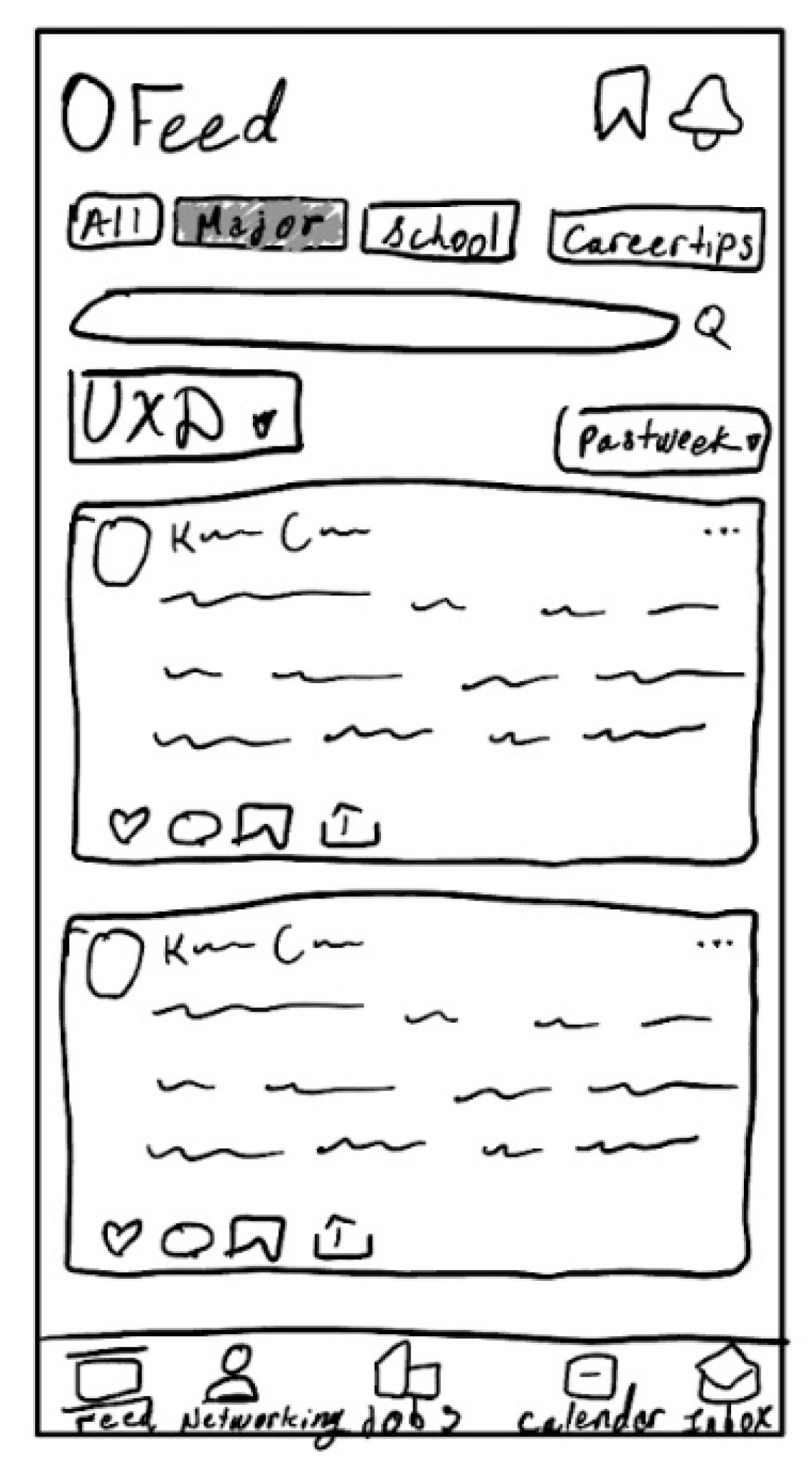
I consolidated the fragmented "Explore" and "Feed" pages into a unified experience, creating clearer content categorization. The new architecture separates job-focused content from networking features, allowing users to engage with relevant functionality without distraction.
Wireframing & Design Development
Starting with low-fidelity sketches, I iterated through multiple design approaches for core features: job filtering, employer messaging, and profile completion. The wireframing process focused on reducing interaction steps while maintaining comprehensive functionality.
Prioritize job search functionality over social features
Streamline navigation to reduce cognitive load
Enhance networking capabilities while maintaining professional focus
Improve profile completion through guided prompts
Design Principles Established
Merged redundant navigation sections
Created distinct pathways for job search vs. networking
Implemented progressive disclosure for advanced features
Established clear visual hierarchy for content prioritization
Key Structural Changes
Replaced TikTok-style feed with organized job and career advice sections
Added one-click messaging options directly within job postings
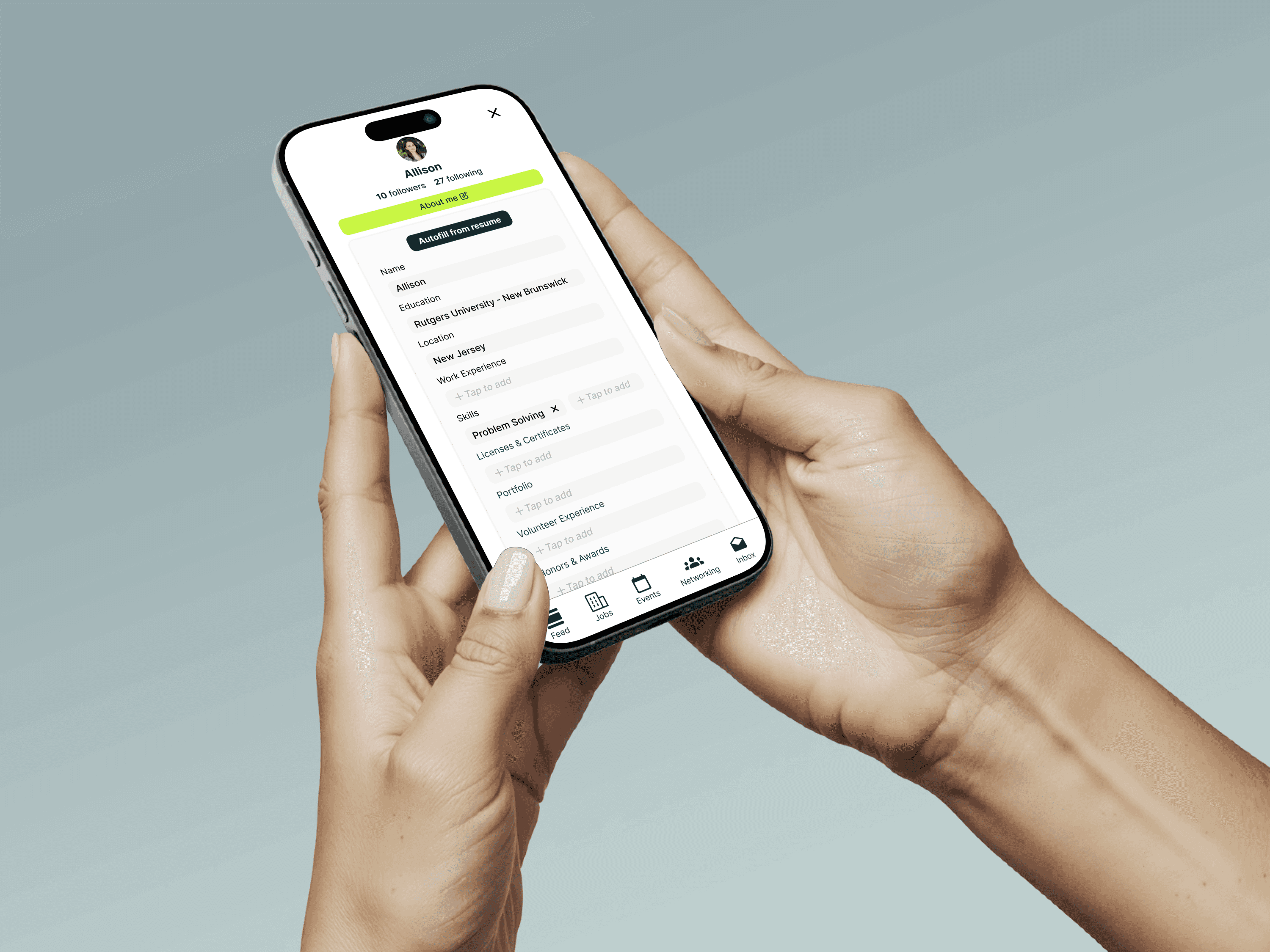
Implemented resume auto-fill functionality to encourage profile completion
Created card-based networking interface highlighting relevant connection information
Critical Design Decisions
Low fidelity wireframes
Final Solution
Solution Overview
The redesigned Handshake experience transforms the platform from a social media-like interface into a focused career development tool. By consolidating navigation, improving job recommendation accuracy, and enhancing networking capabilities, the solution addresses core user frustrations while maintaining the platform's university-integrated advantages.
Key Features & Functionality
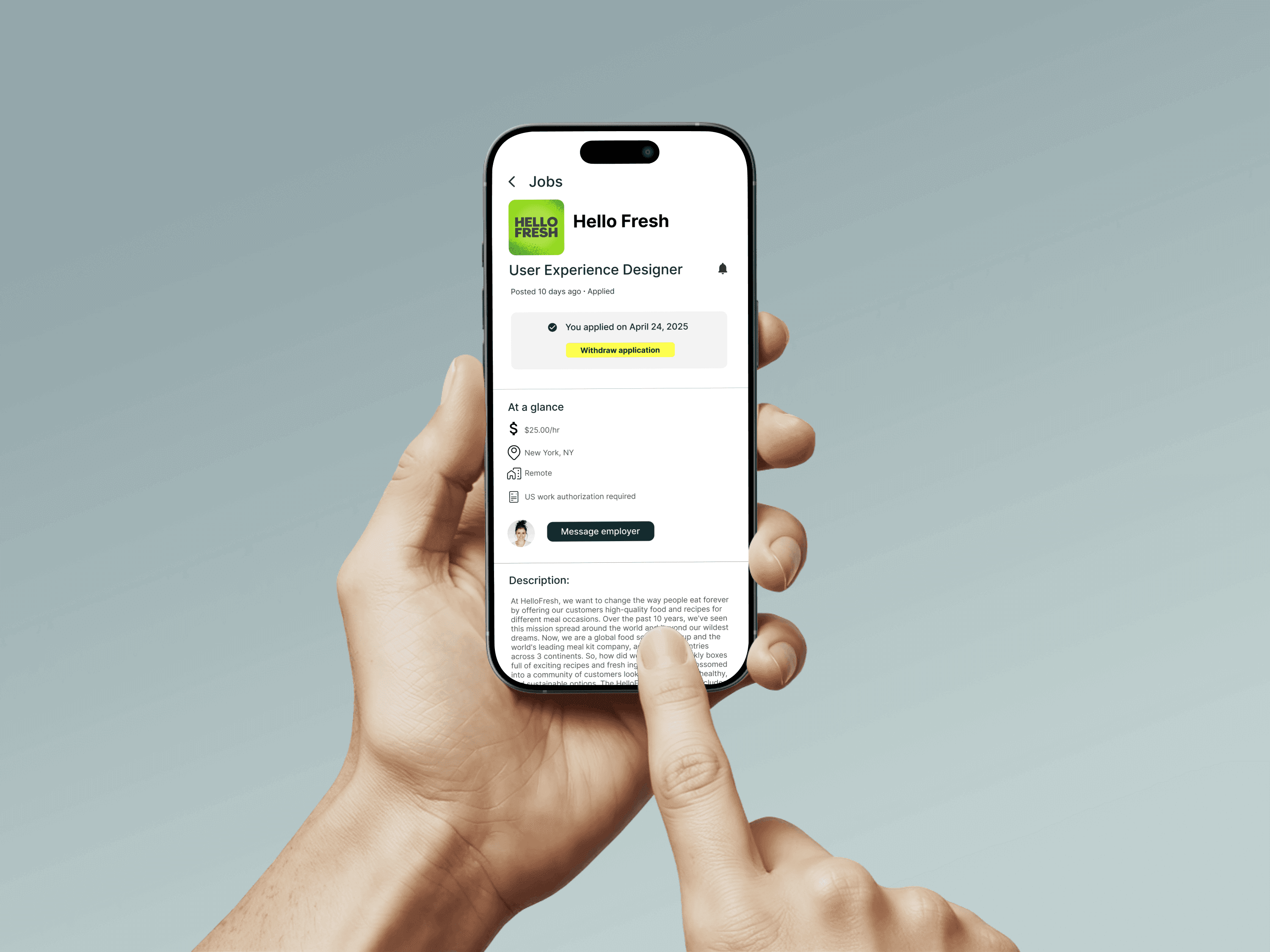
Enhanced Messaging System
Direct messaging access from job postings and employer profiles
Template messages for common networking scenarios (informational interviews, application follow-ups)
Portfolio link sharing capability for design and technical roles
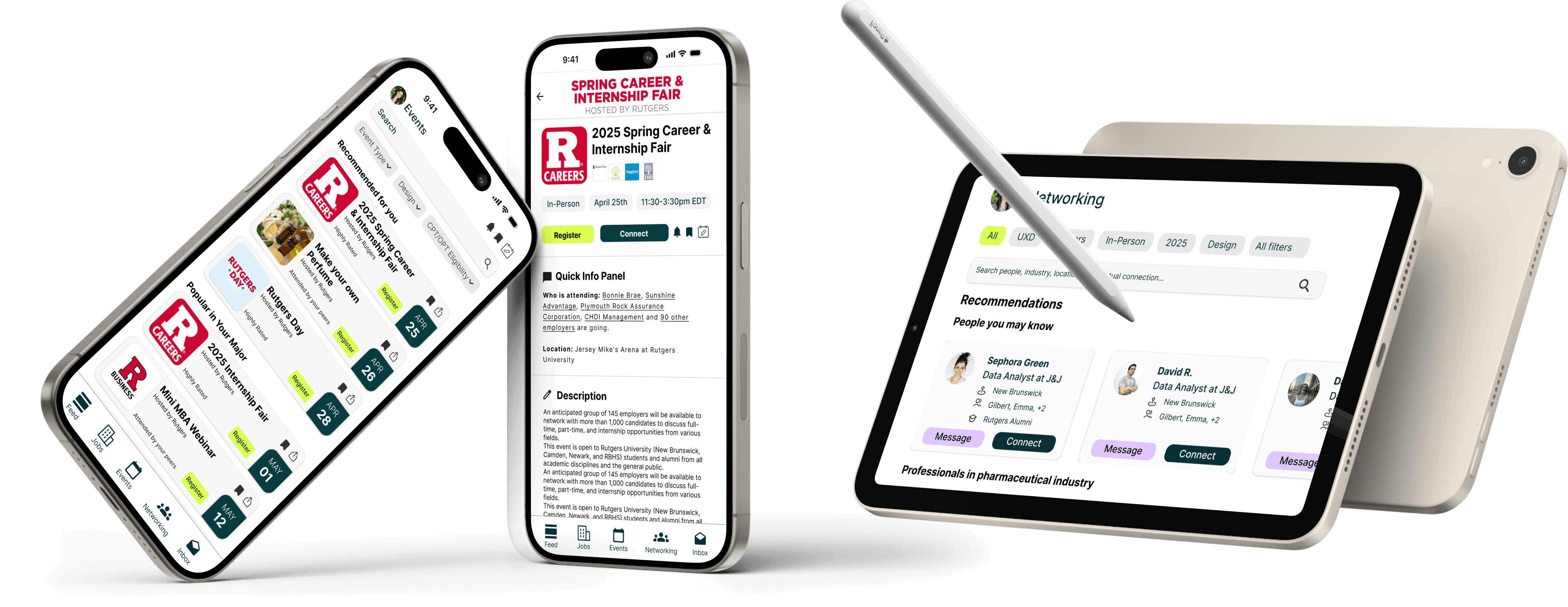
Consolidated "Explore" and "Feed" into organized sections with clear content categories
Separated career advice, job postings, and networking content for focused user engagement
Implemented content filters allowing users to customize their experience based on career stage and interests
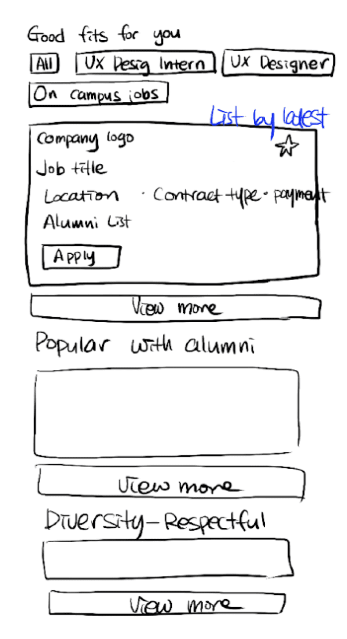
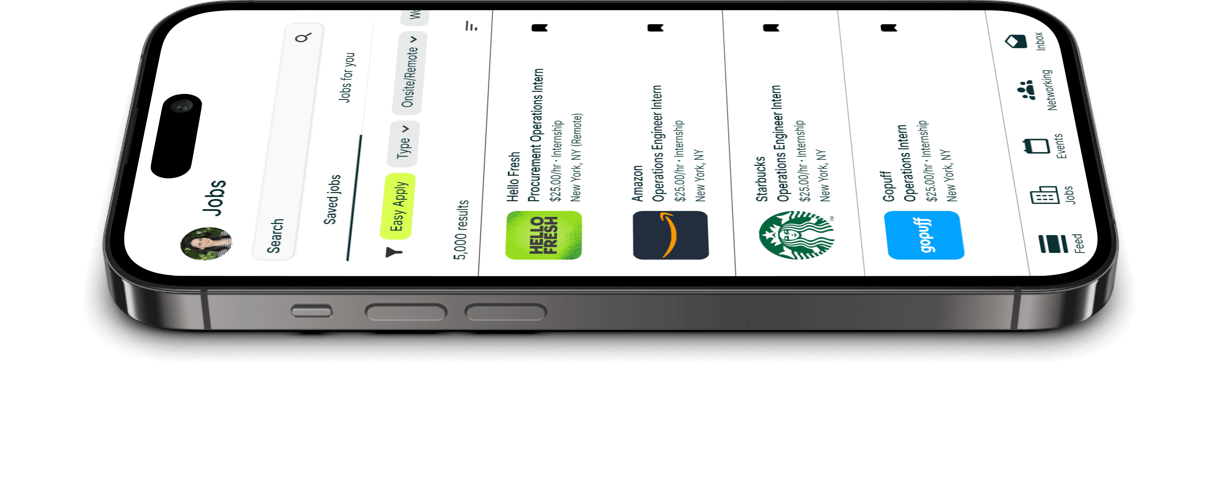
Improved Job Discovery
Functional filtering system with reliable location, job type, and industry options
Enhanced search relevance based on complete profile information
Application status tracking with clear progress indicators
Resume auto-fill functionality reducing manual data entry
Progressive completion prompts highlighting profile gaps
Skills verification through coursework integration and project showcases
Unified Feed Experience
Streamlined Profile Completion
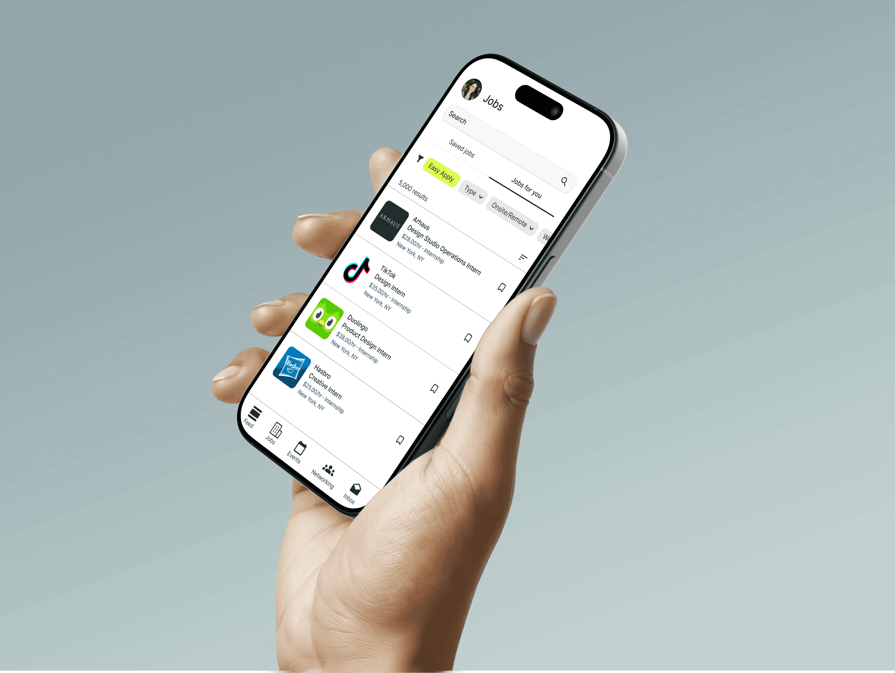
Final prototype
"I can see their information here in the card of each of them, and I saw her job and I saw her university and I know that she's the one I'm looking for." - Testing Participant
KEY TESTING FINDINGS
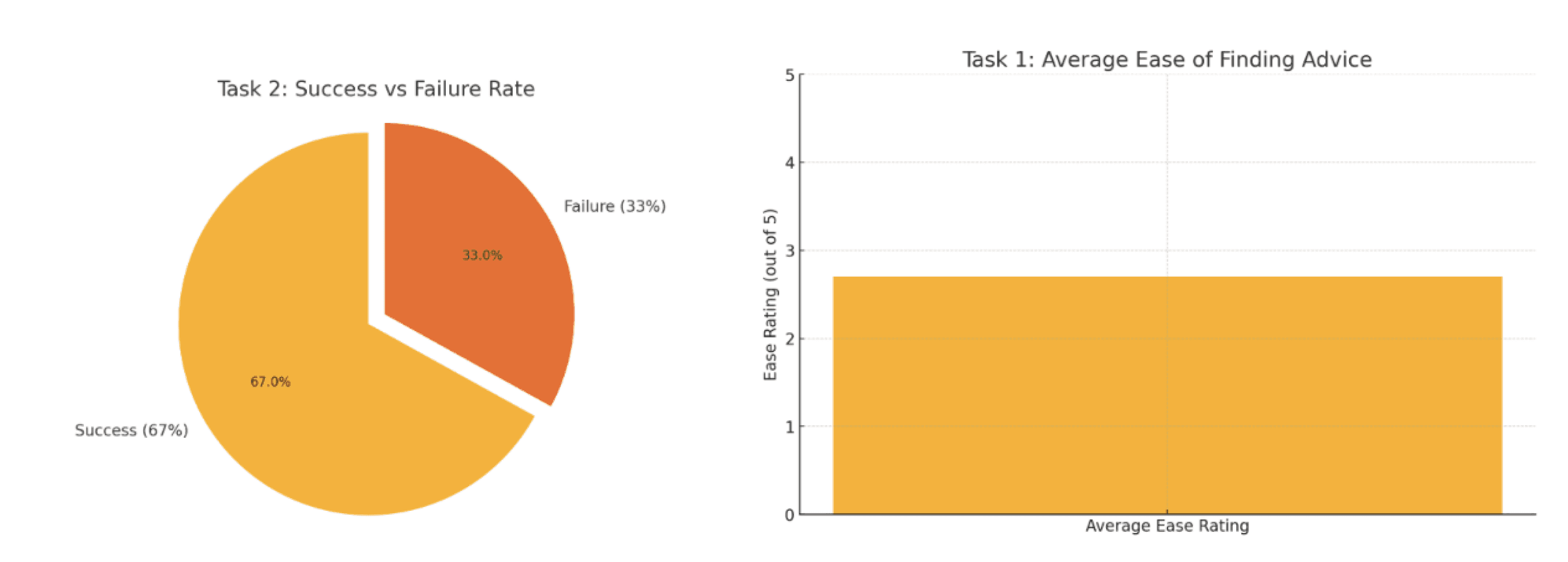
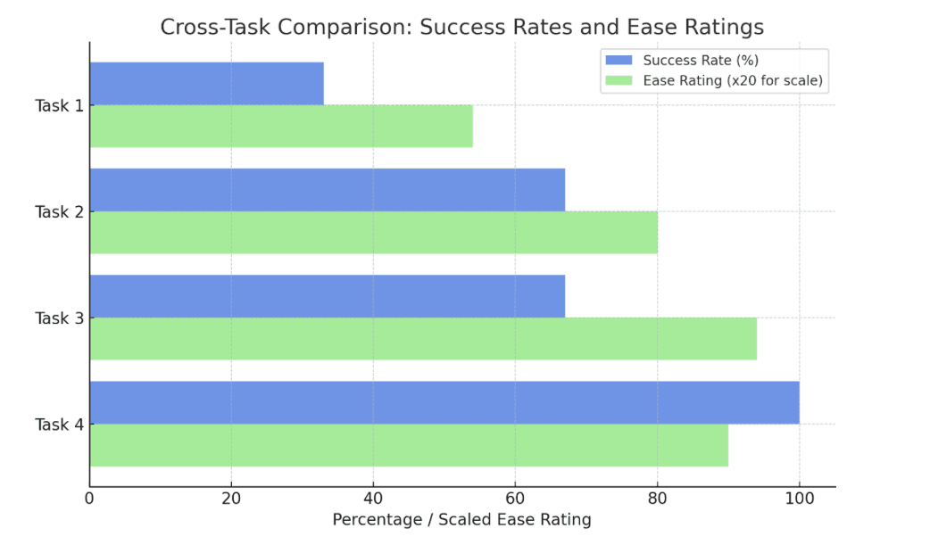
Career advice discovery: 33% success rate revealed need for clearer content organization
Alumni networking: 67% success rate with positive feedback on card-based profile display
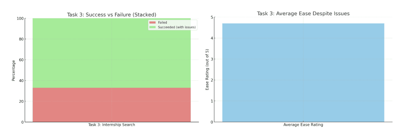
Remote job applications: 67% success despite filter functionality issues
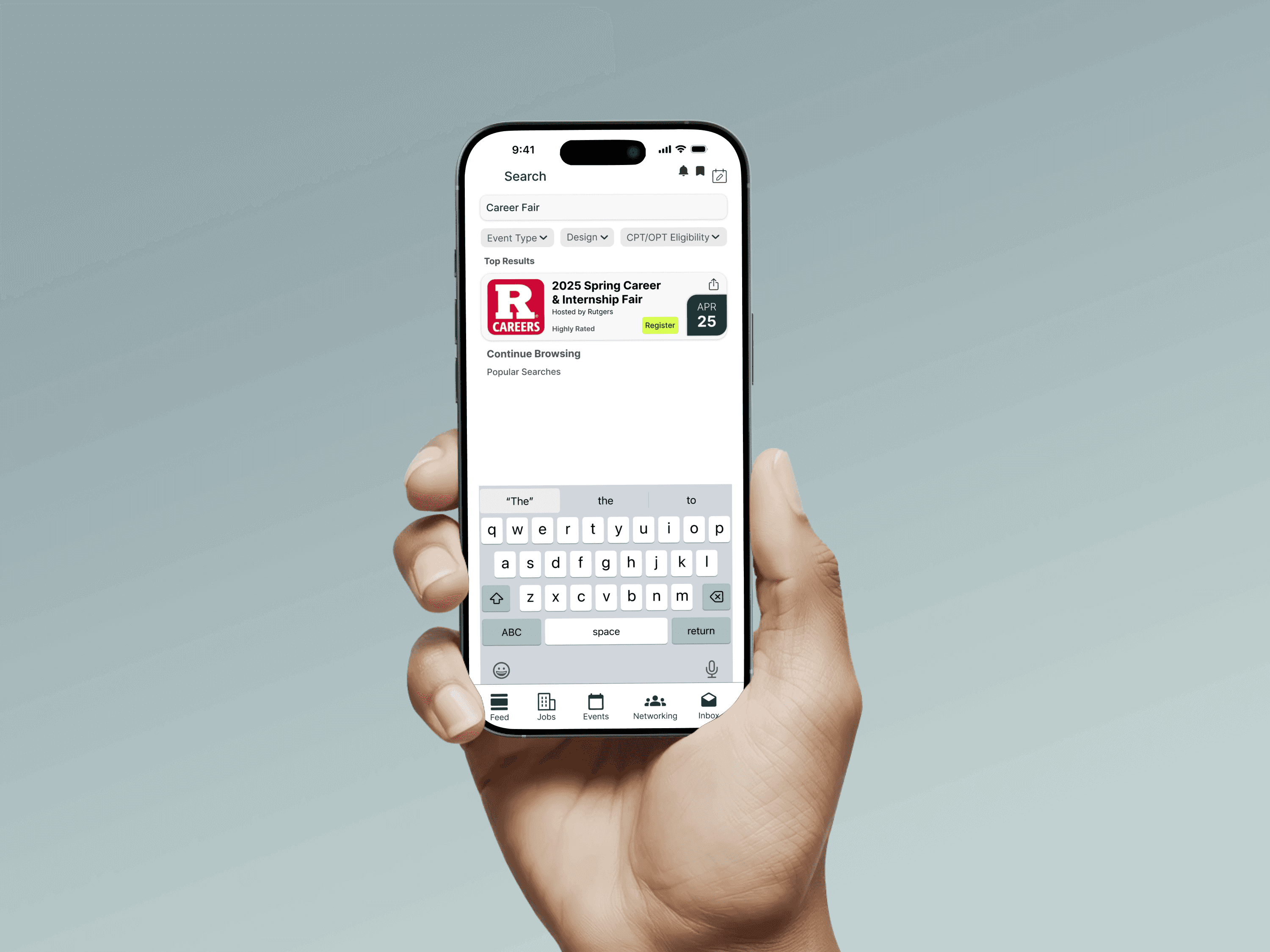
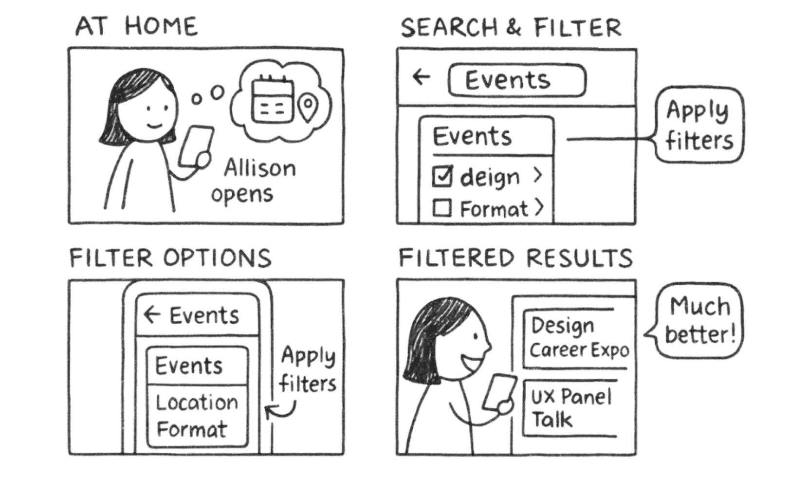
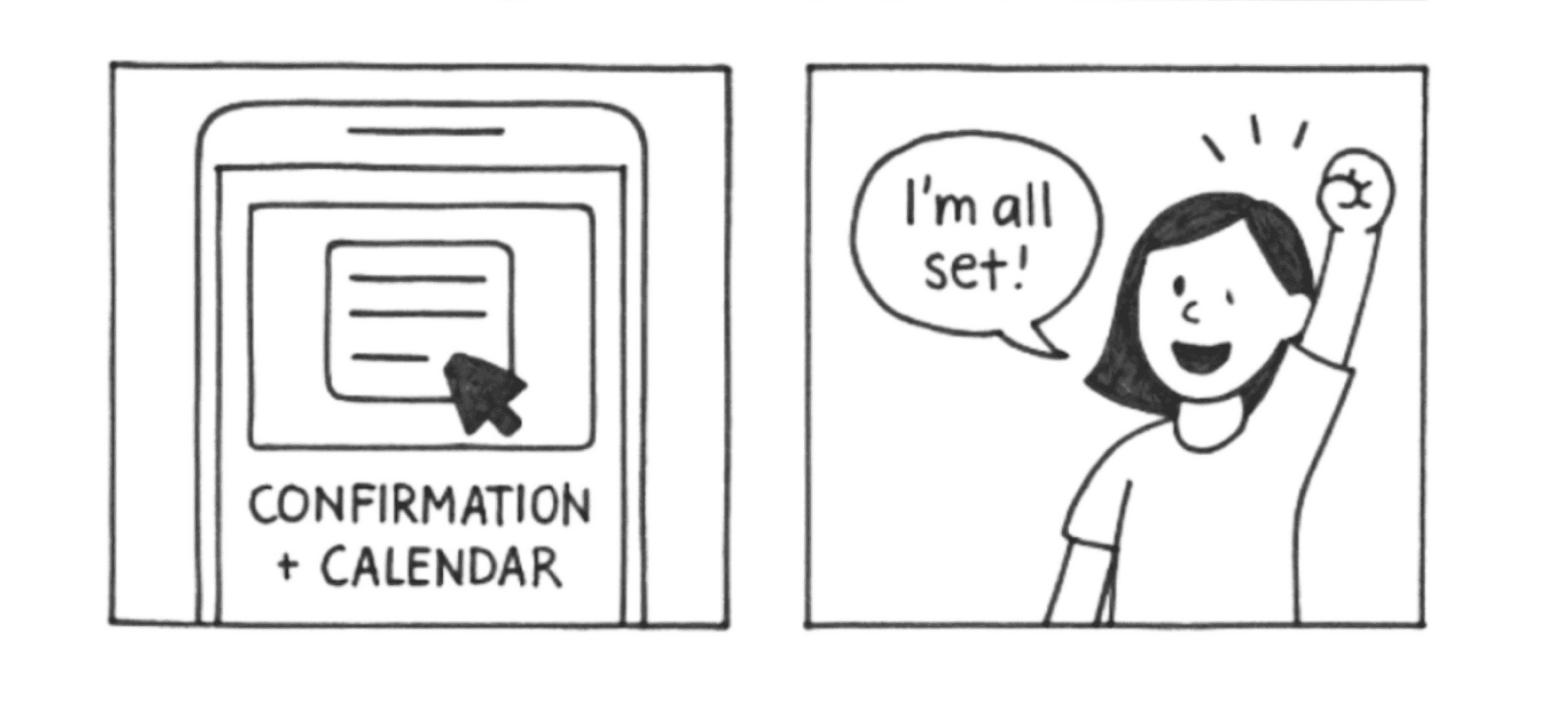
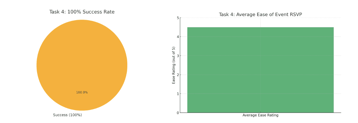
Event registration: 100% success rate, though terminology confusion emerged around "RSVP"
Testing & Validation
Testing Methodology
I conducted prototype testing with 3 participants representing diverse user segments, using 4 core task scenarios: finding career advice, networking with alumni, applying for remote positions, and registering for career events. Each 30-minute session combined task observation with think-aloud protocols to capture both behavioral data and user reasoning.
Design Iterations
Based on testing feedback, I implemented critical improvements:
Reorganized feed content with clearer career advice identification
Replaced "RSVP" terminology with universally understood "Register" language
Increased button sizes for improved accessibility and mobile interaction
Added explanatory text for international users unfamiliar with certain terminology
User Experience Flow
The redesigned experience follows a logical progression: users complete comprehensive profiles through guided prompts, receive accurate job recommendations, easily apply and message employers, and track application progress through clear status indicators. Each interaction is designed to support students' primary goal of securing relevant career opportunities.
Task Success Improvements
Testing result visualization
Cross-task comparison charts
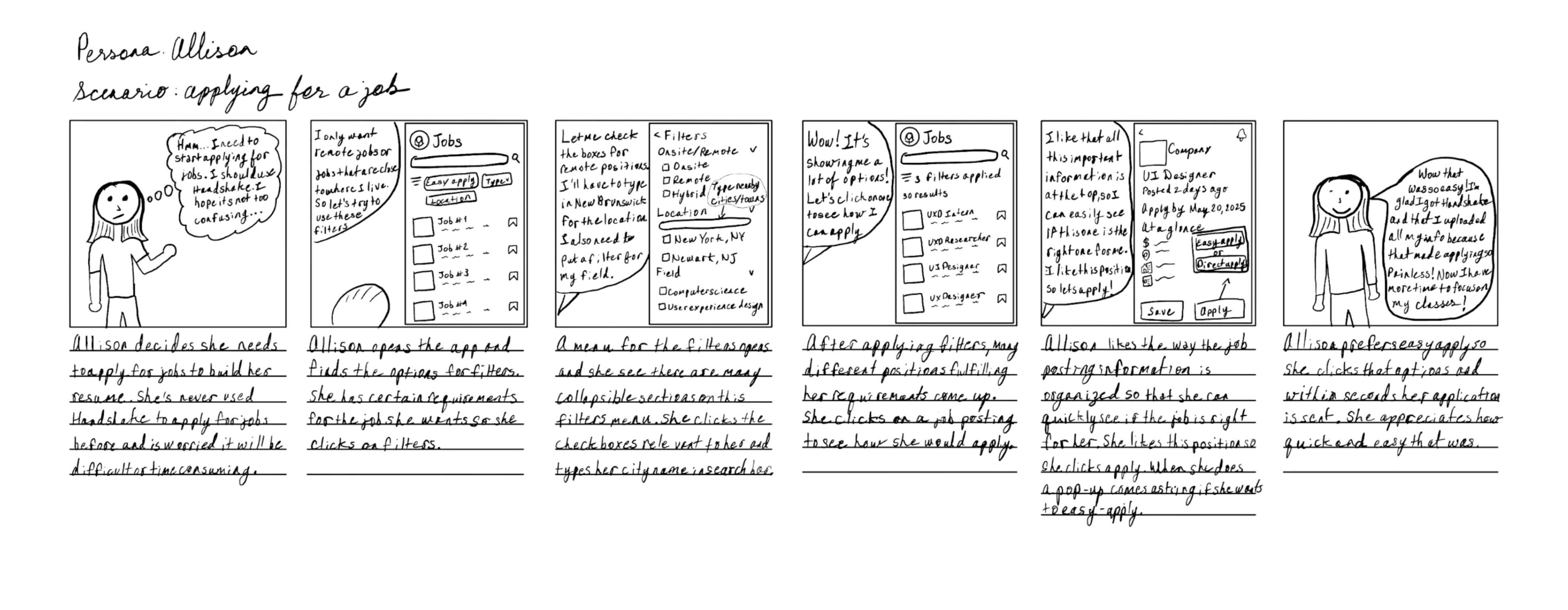
Story Board - Job application filter
Story Board - Event Registration
Story Board - Messaging workflow
Task success rate charts & Ease of use rating graphs
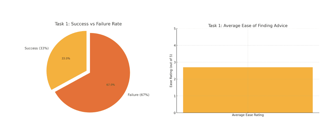
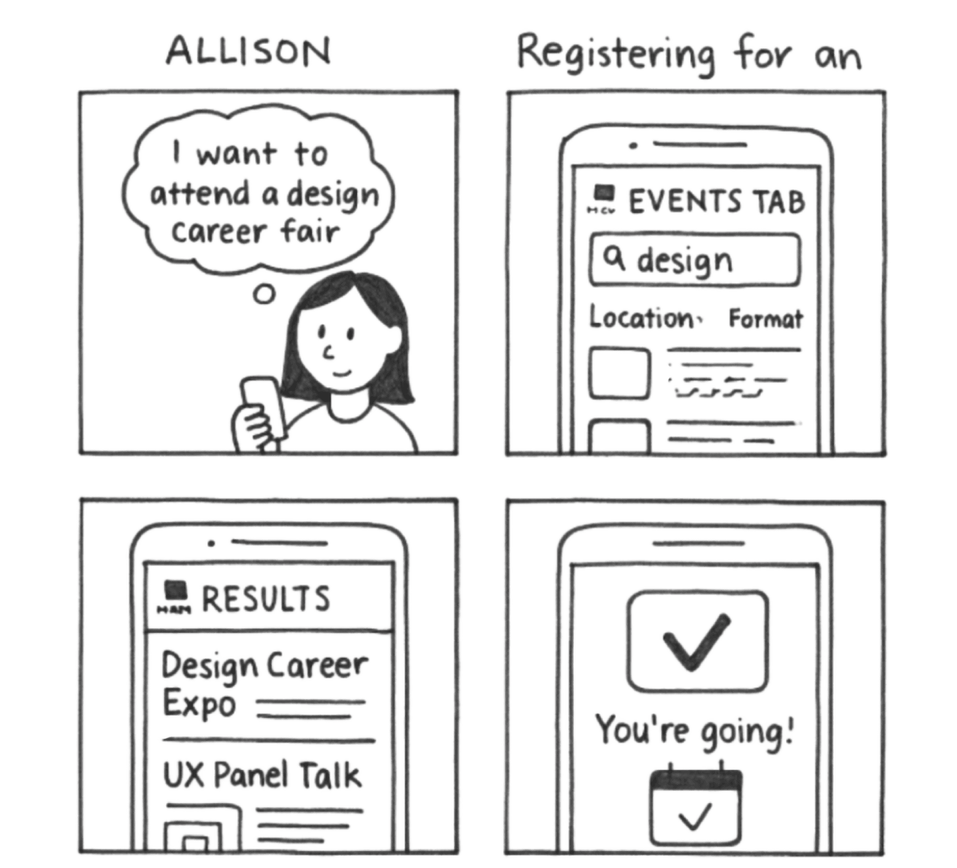
Task 1: Finding Career Change Advice through Feed
Task 2: Networking with Alumni and Sending Messages
Task 3: Finding and Applying to a Remote Internship
Task 4: RSVP to a Career Fair Event
Impact & Results
Through contextual inquiry and iterative design, we transformed Handshake from a cluttered social platform into a focused career tool. The redesigned experience prioritizes job search functionality while maintaining university-specific advantages that differentiate it from LinkedIn.
Business Impact
Enhanced platform differentiation and employer satisfaction through streamlined student profiles and reduced support overhead.
User Impact
Design Impact
Established scalable design system and validated contextual inquiry methodology for educational technology platforms.
Event registration success rate
100%
Alumni networking task completion
67%
Career advice discoverability improvement
33→100%
User engagement through streamlined navigation
Enhanced
"If the filters worked, it would be a four because I don't know the difference between the feed versus the networking tab since the filters are the same." - Testing Participant feedback informing design decisions
Project Learnings
1. Context reveals authentic behavior
Observing students in their natural environments uncovered usage patterns that traditional lab testing would miss. Users' relationships with career platforms are deeply influenced by university culture, peer behavior, and academic pressures—not just individual preferences.
2. Simplicity serves students best
Students use job platforms during fragmented time between classes and study sessions. Removing social media distractions and consolidating navigation reduced cognitive load, allowing users to focus on their primary goal: finding relevant career opportunities.
3. Test early, iterate continuously
Our prototype testing revealed critical terminology issues and filter malfunctions that could have derailed user adoption. Early validation with diverse user segments—from methodical international students to efficiency-focused job seekers—ensured our solutions worked across different user behaviors and expectations.
Project Overview
Want to work together?
If you like what you see and want to work together, get in touch!
Copyright © 2025 Sai MeghanaReddy Bomma.All rights reserved.