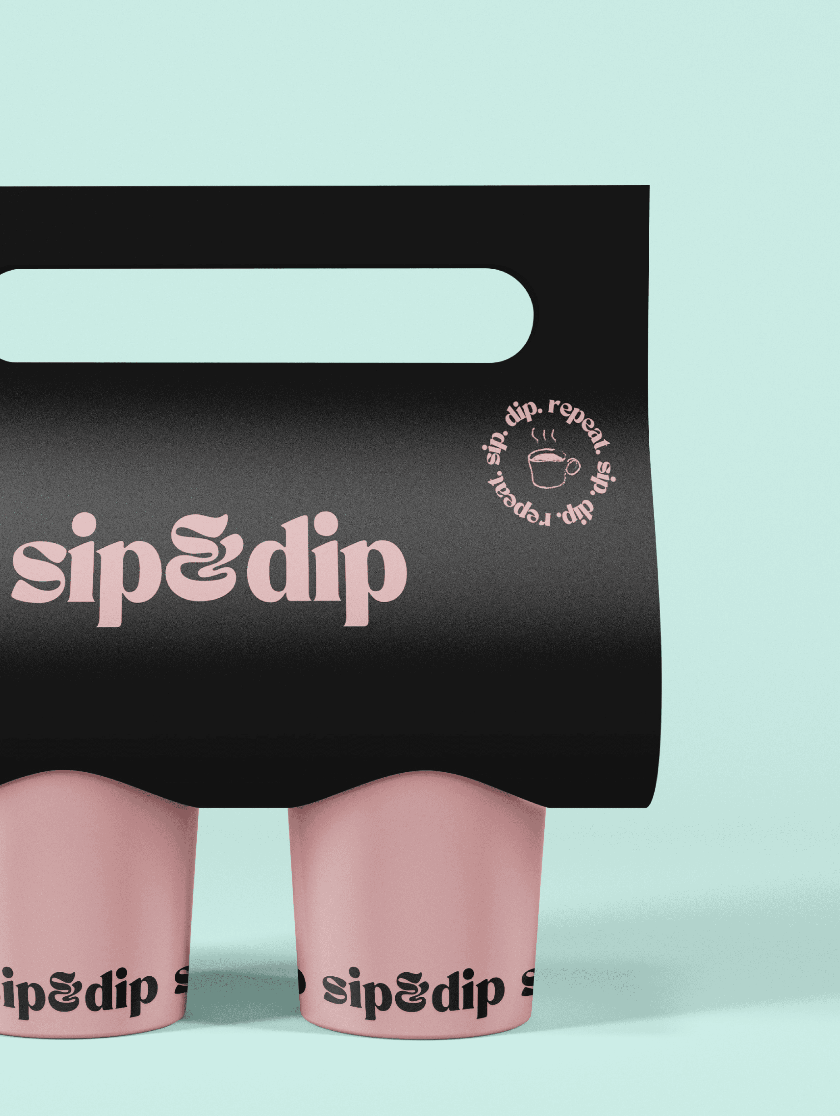
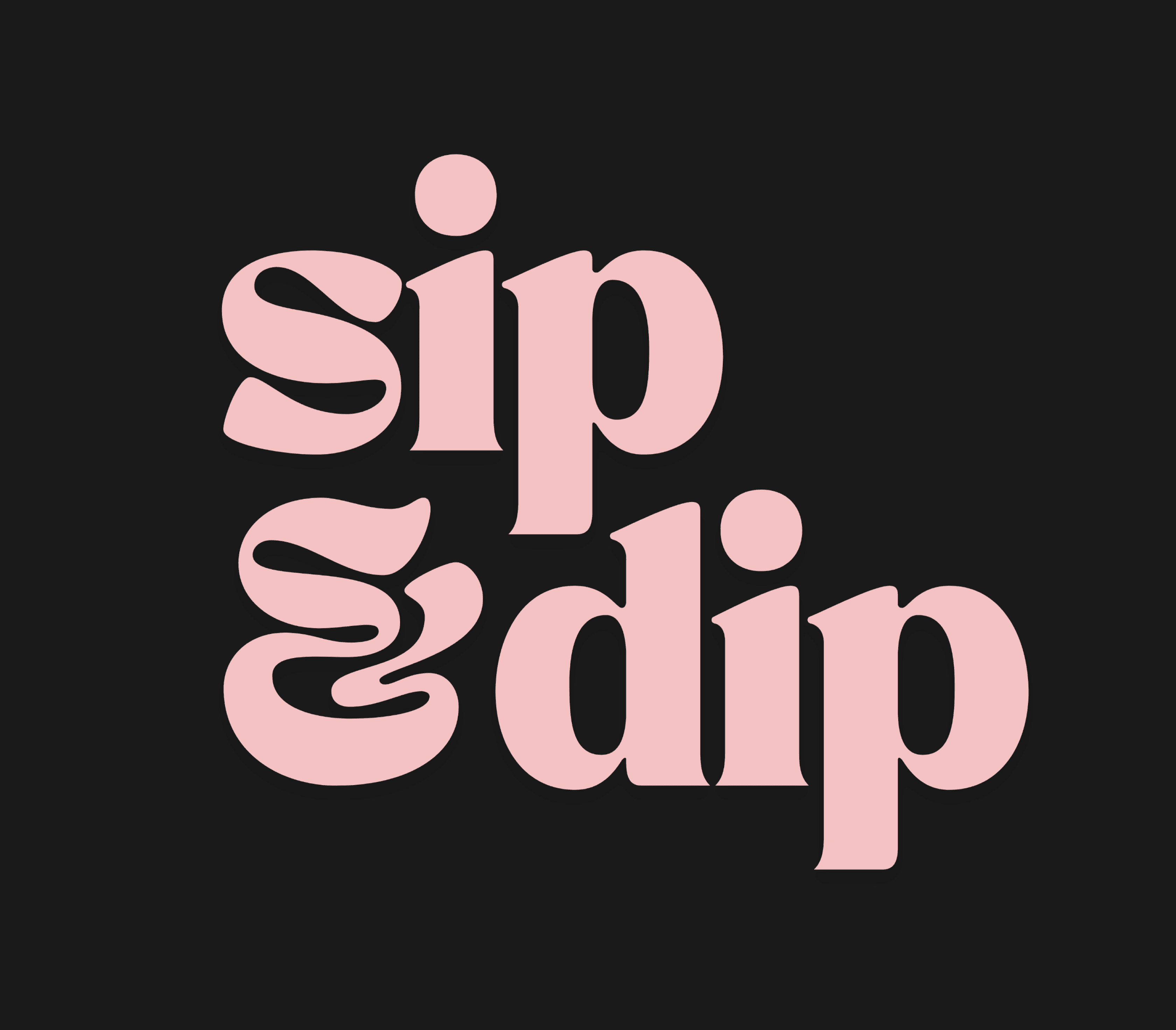
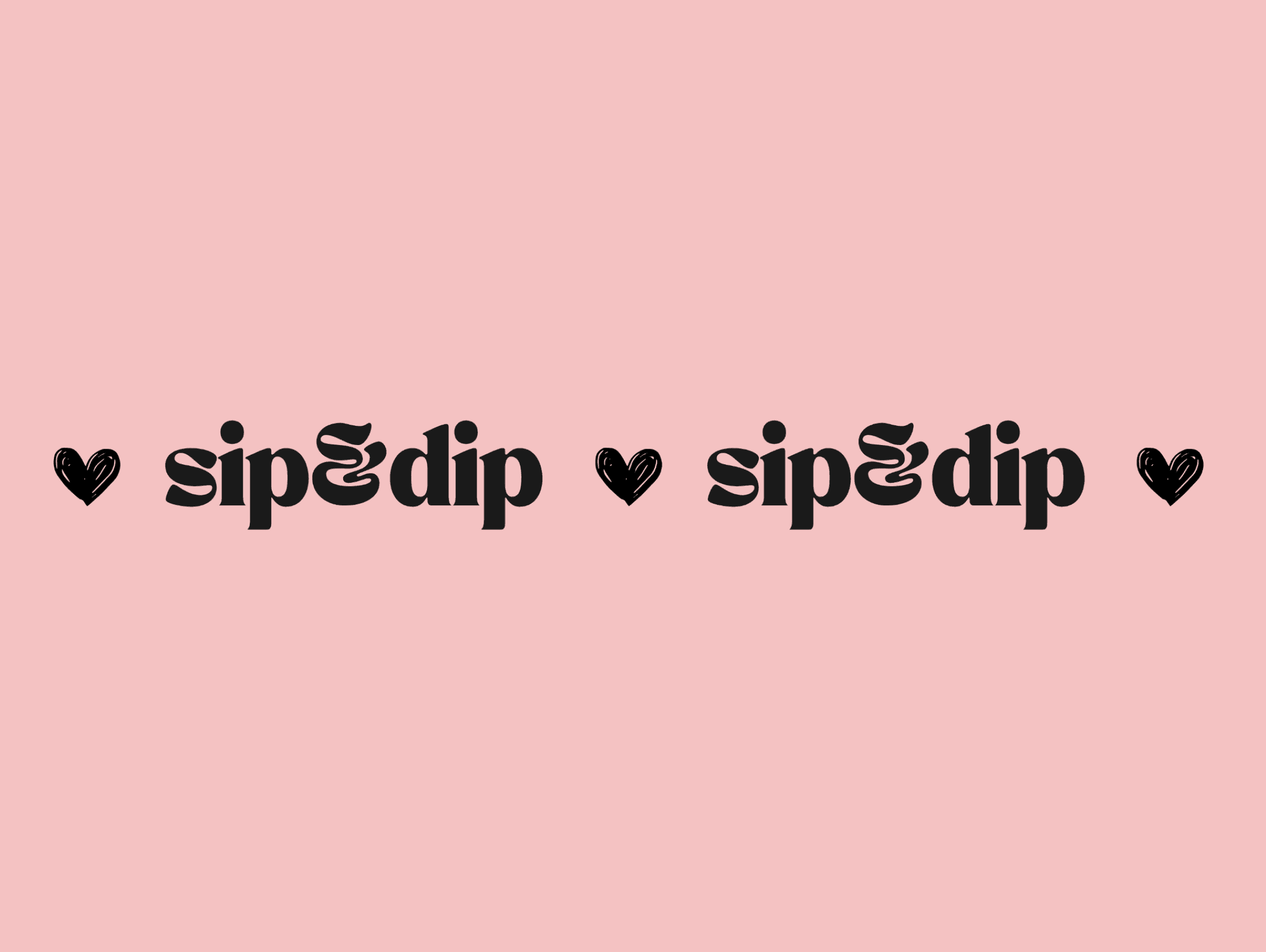
Sip & Dip Coffee
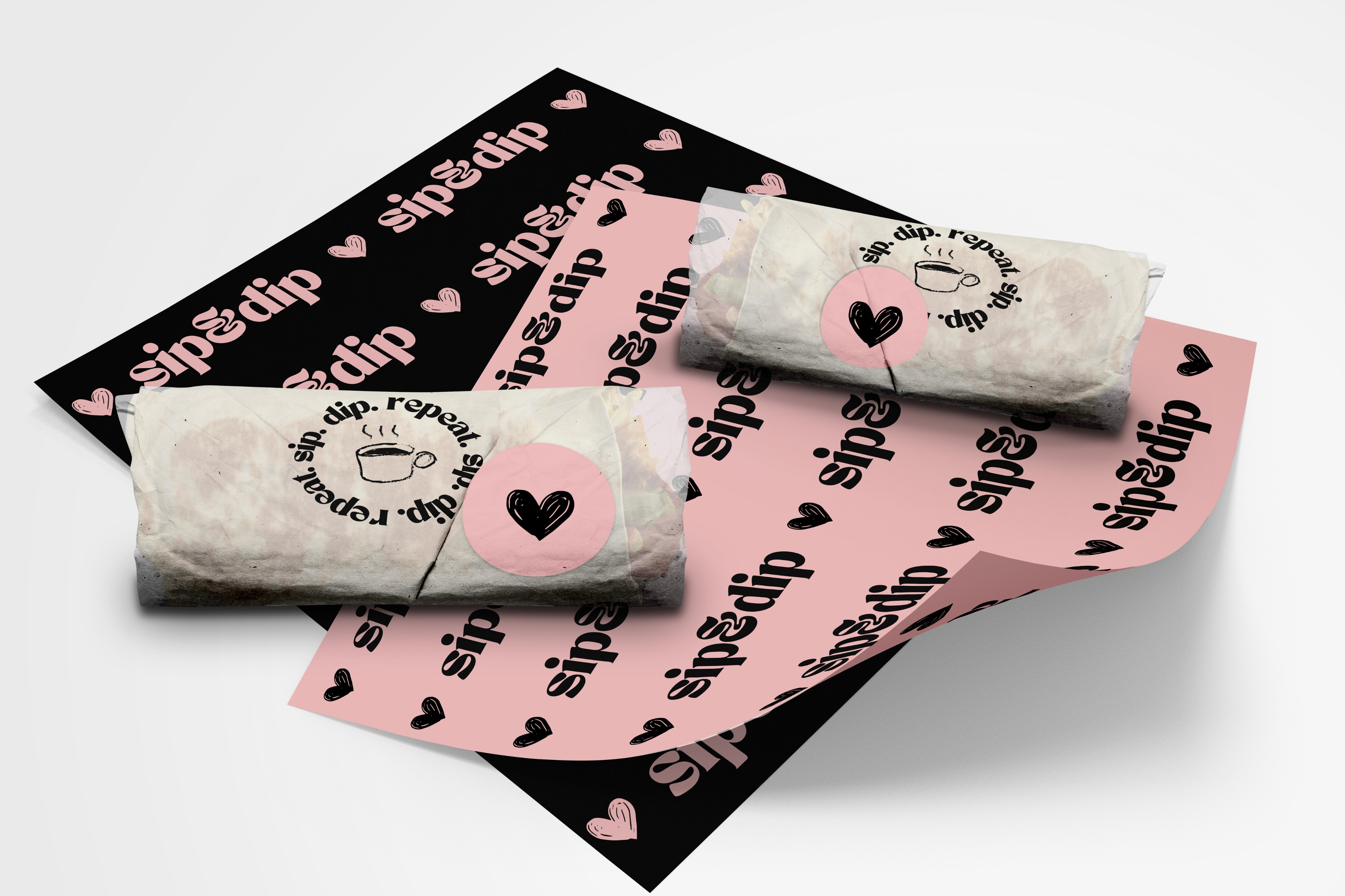
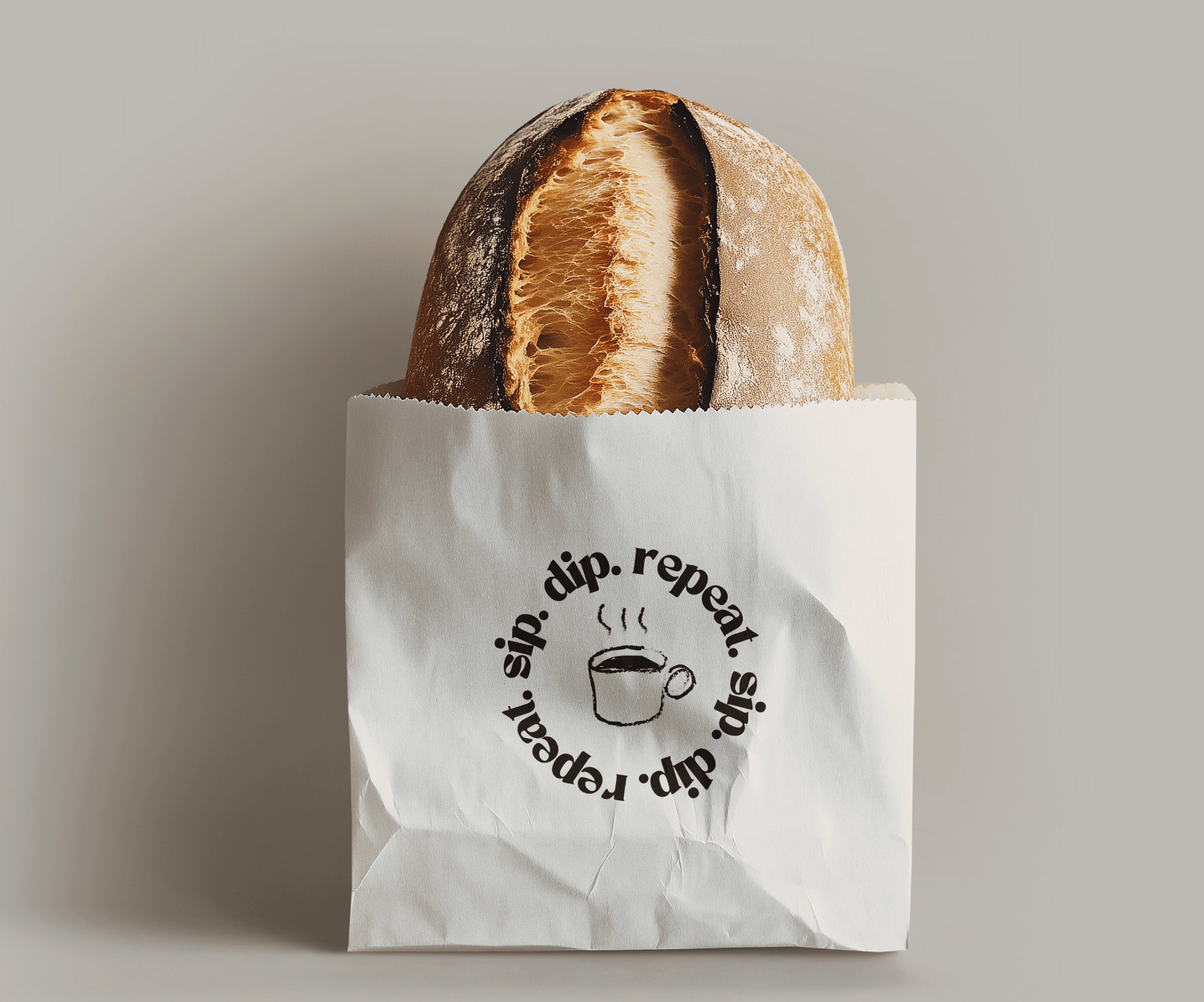
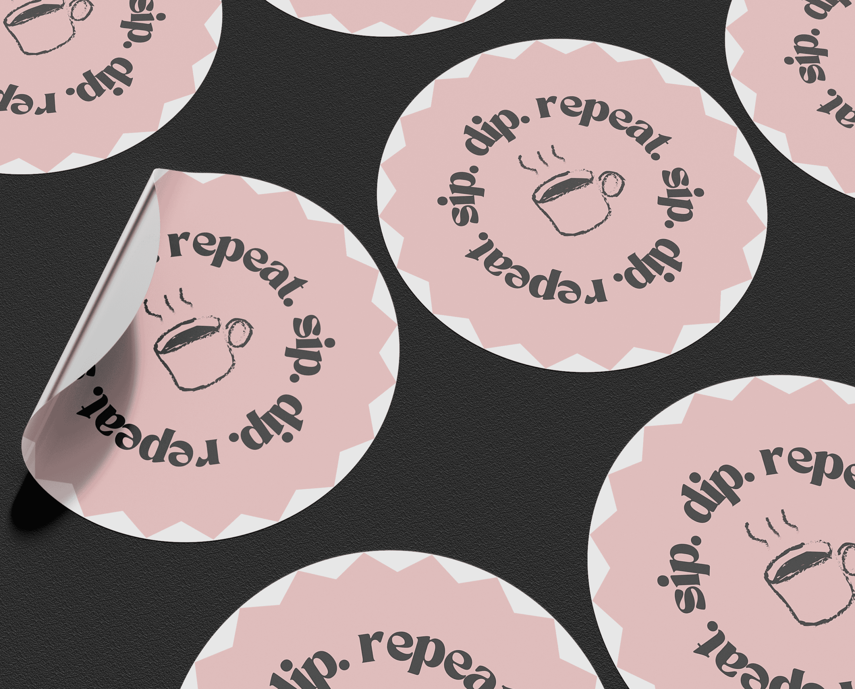
Visual Identity and Branding


Born from the belief that great coffee deserves an equally great companion, Sip & Dip redefines the neighborhood coffee experience through the art of perfect pairings. We're not just another coffee shop - we're the bold answer to a culture that's forgotten how to savor the moment.
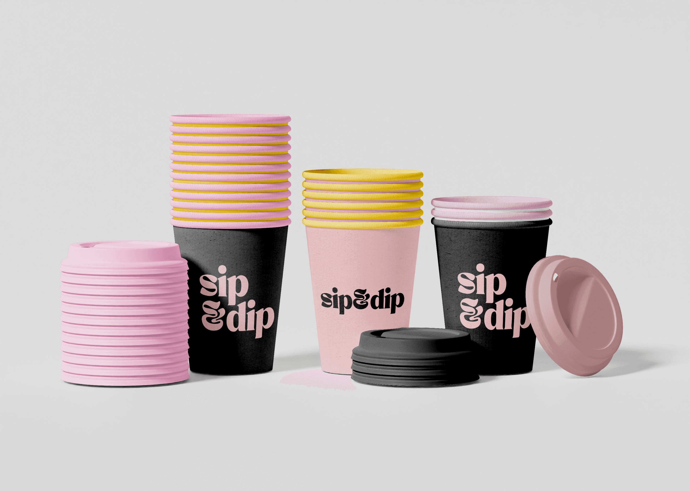
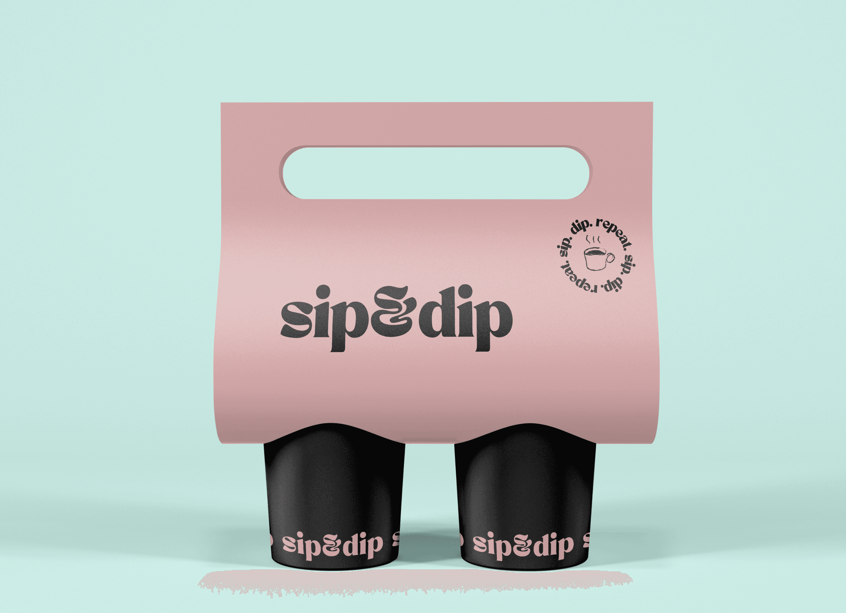
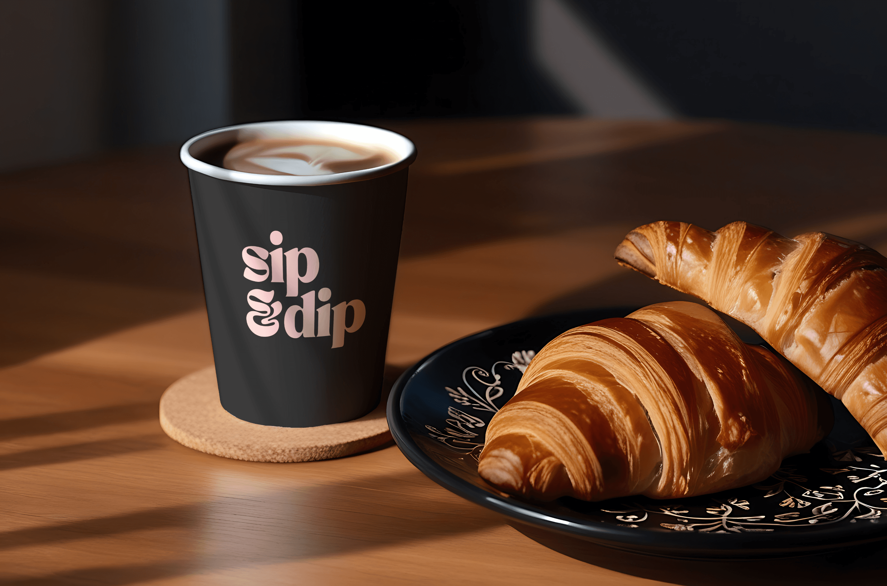
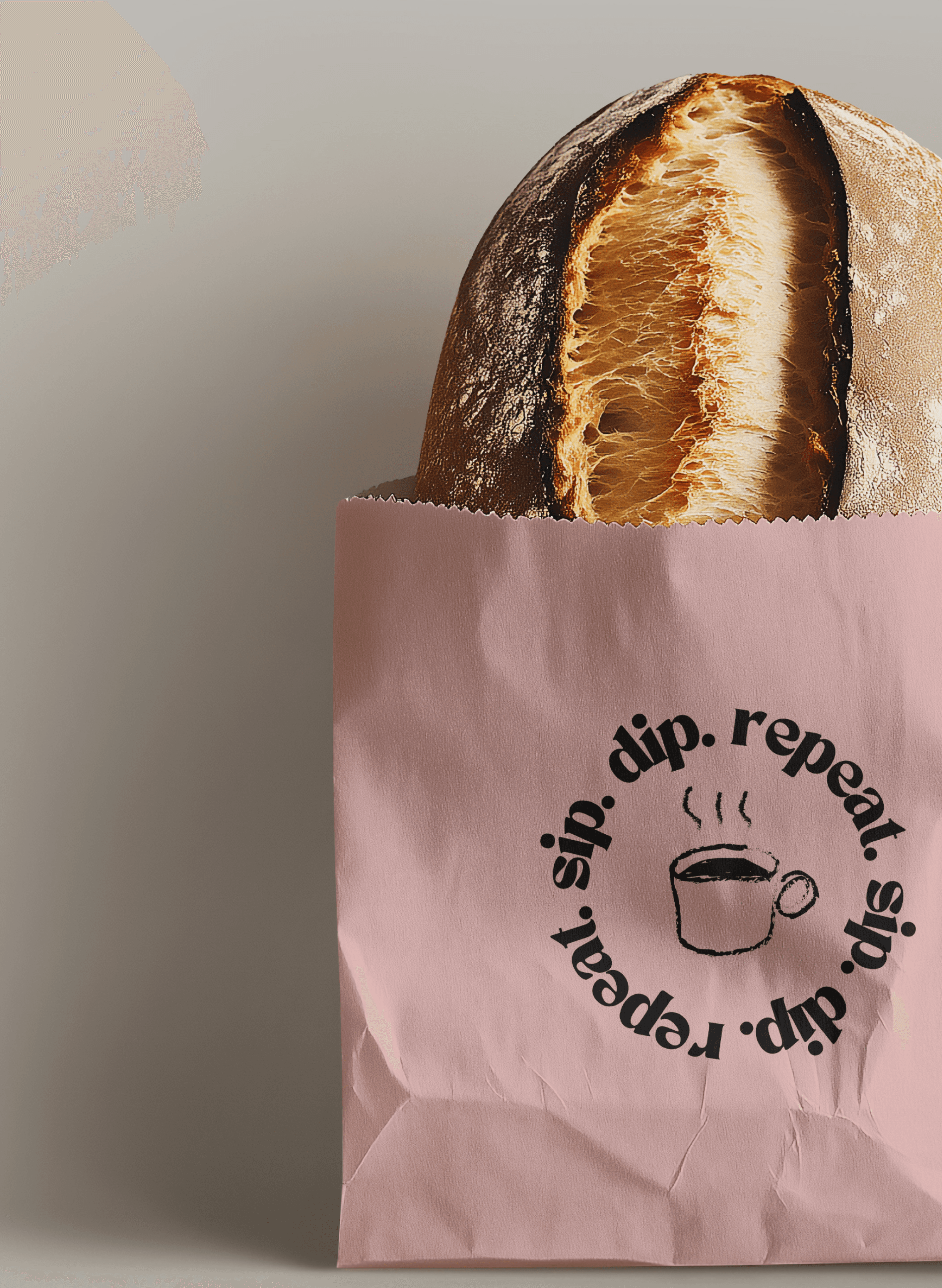
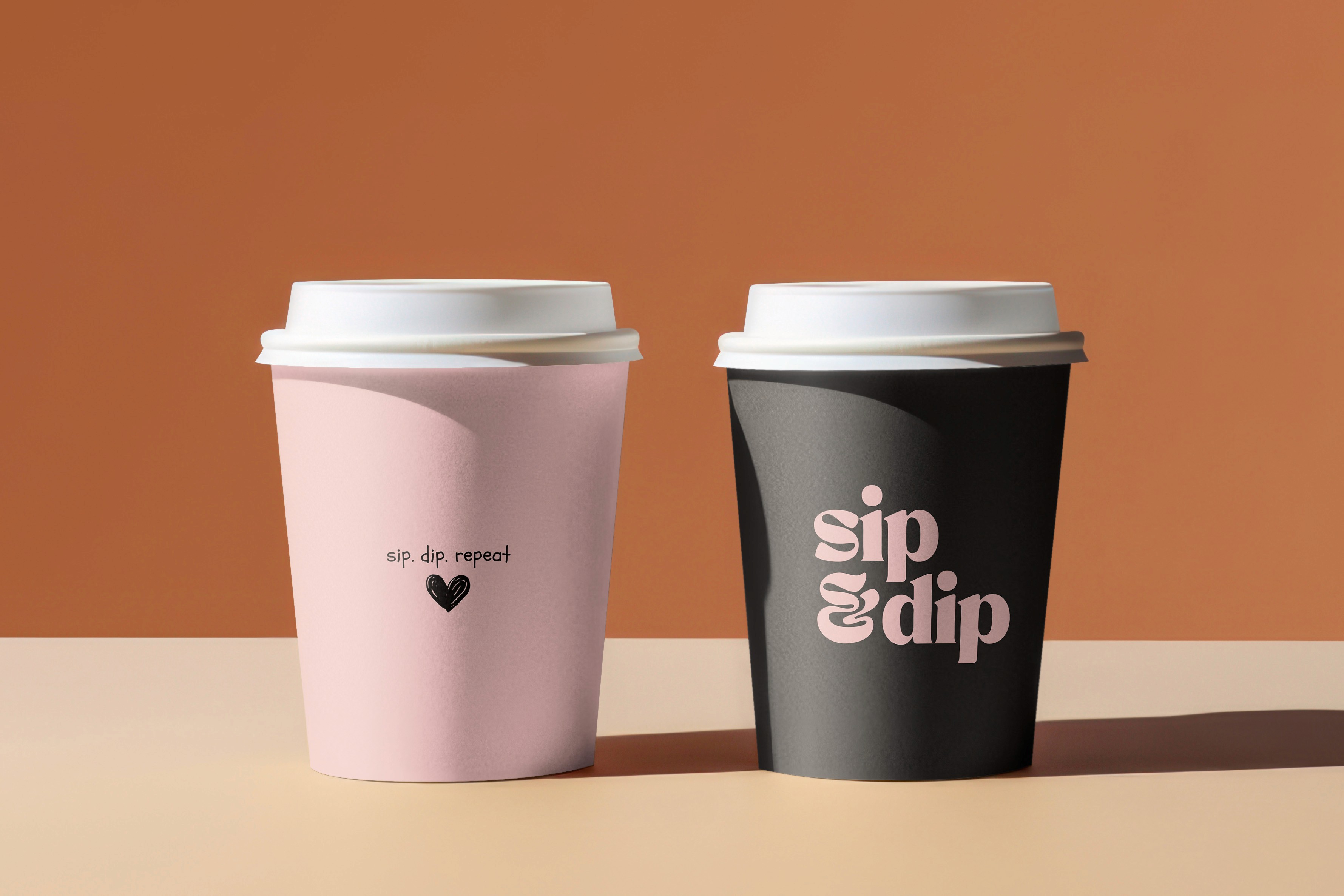
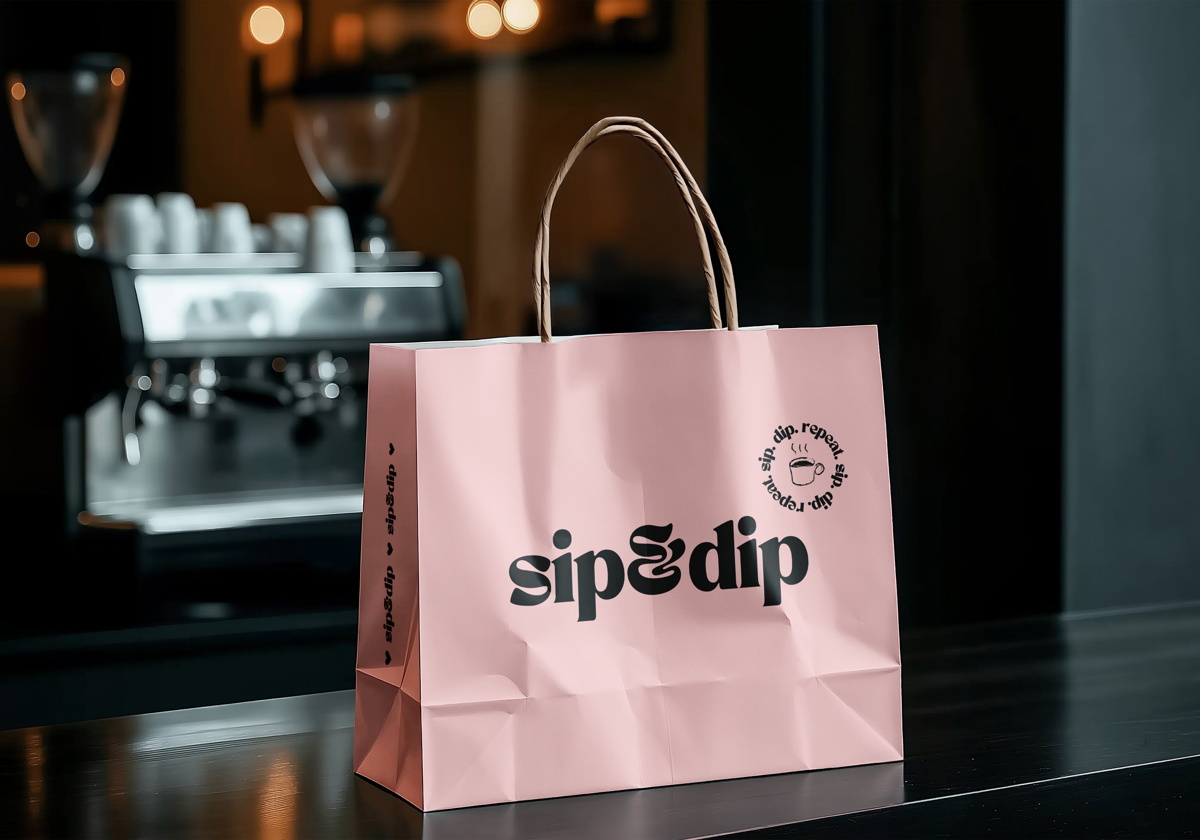
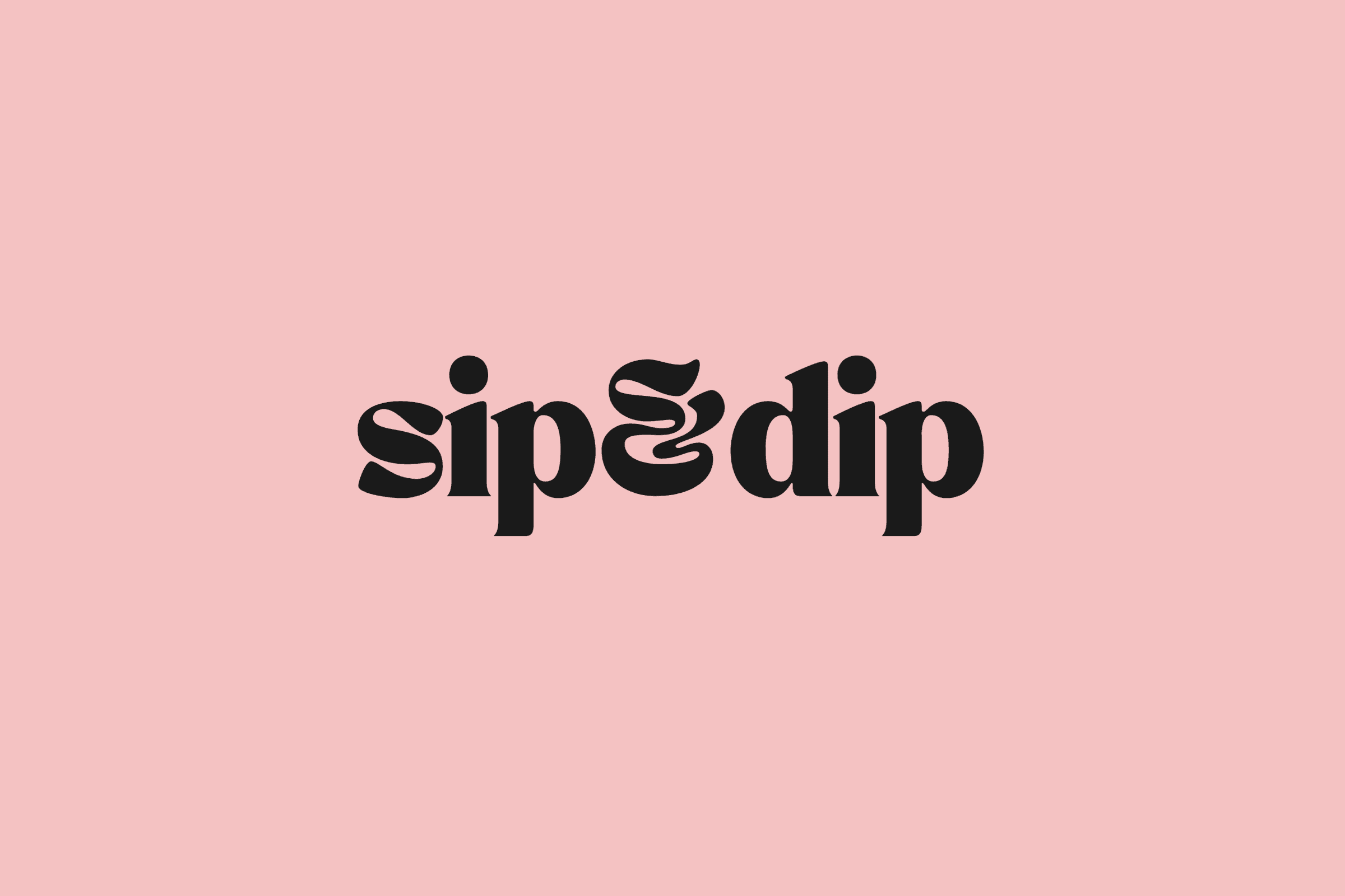
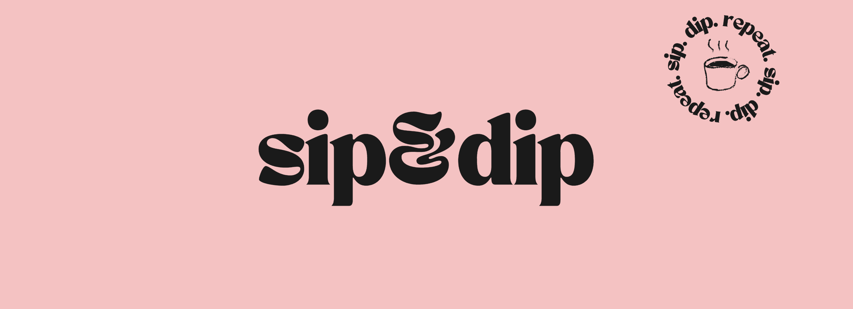
Sip & Dip speaks to the coffee lovers who believe taste and aesthetics should never be compromised, who understand that the best experiences happen when quality meets creativity. Our distinctive black and pink identity isn't just visual - it's a promise that every visit will be as memorable as it is delicious.
We're here to be your daily ritual, your creative fuel, and your reminder that life's best moments deserve to be celebrated. Because at Sip & Dip, extraordinary isn't an accident - it's our standard.

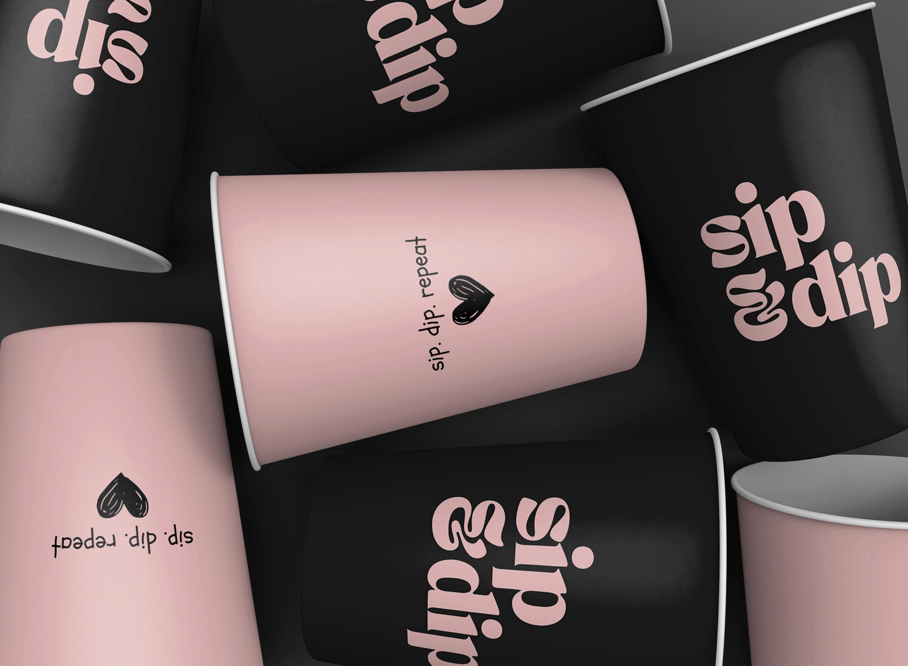
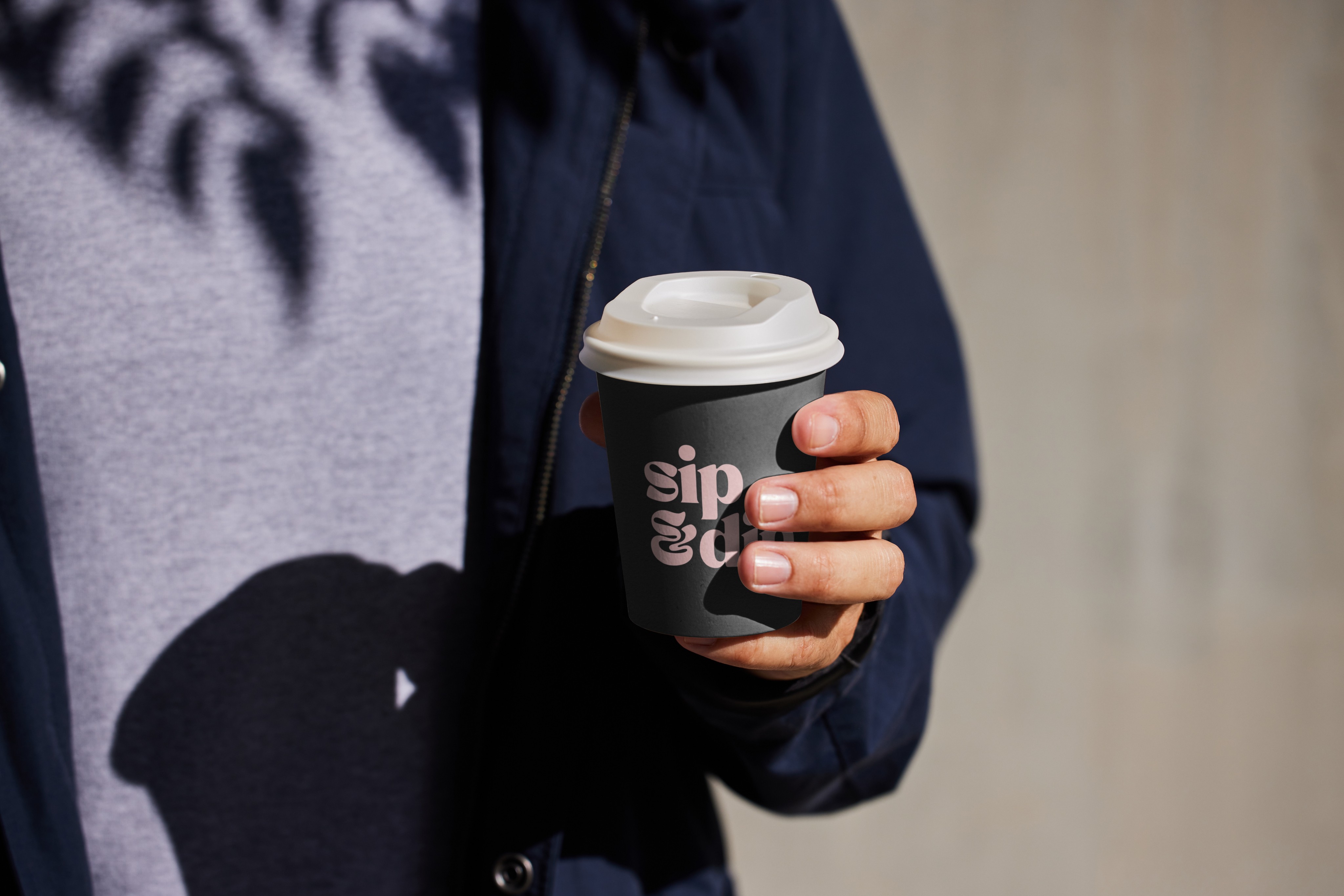
Brand Color
Our color palette pairs bold contrasts with soft warmth to capture the soul of Sip & Dip confident yet inviting, modern yet timeless.
It's inspired by the perfect coffee moment where strength meets sweetness, creating an experience that's both striking and comforting.
Dramatic but never intimidating, playful but never childish, these colors balance bold statements with gentle welcome, just like the perfect pairing.

2025
Deep Black
HEX #1A1A1A
Pure White
HEX ##FFFFFF
Grey Charcoal
HEX #2C2C2C
Accent Pink
HEX #FFB6C1

Want to work together?
If you like what you see and want to work together, get in touch!
Copyright © 2025 Sai MeghanaReddy Bomma.All rights reserved.