
UX CASESTUDY
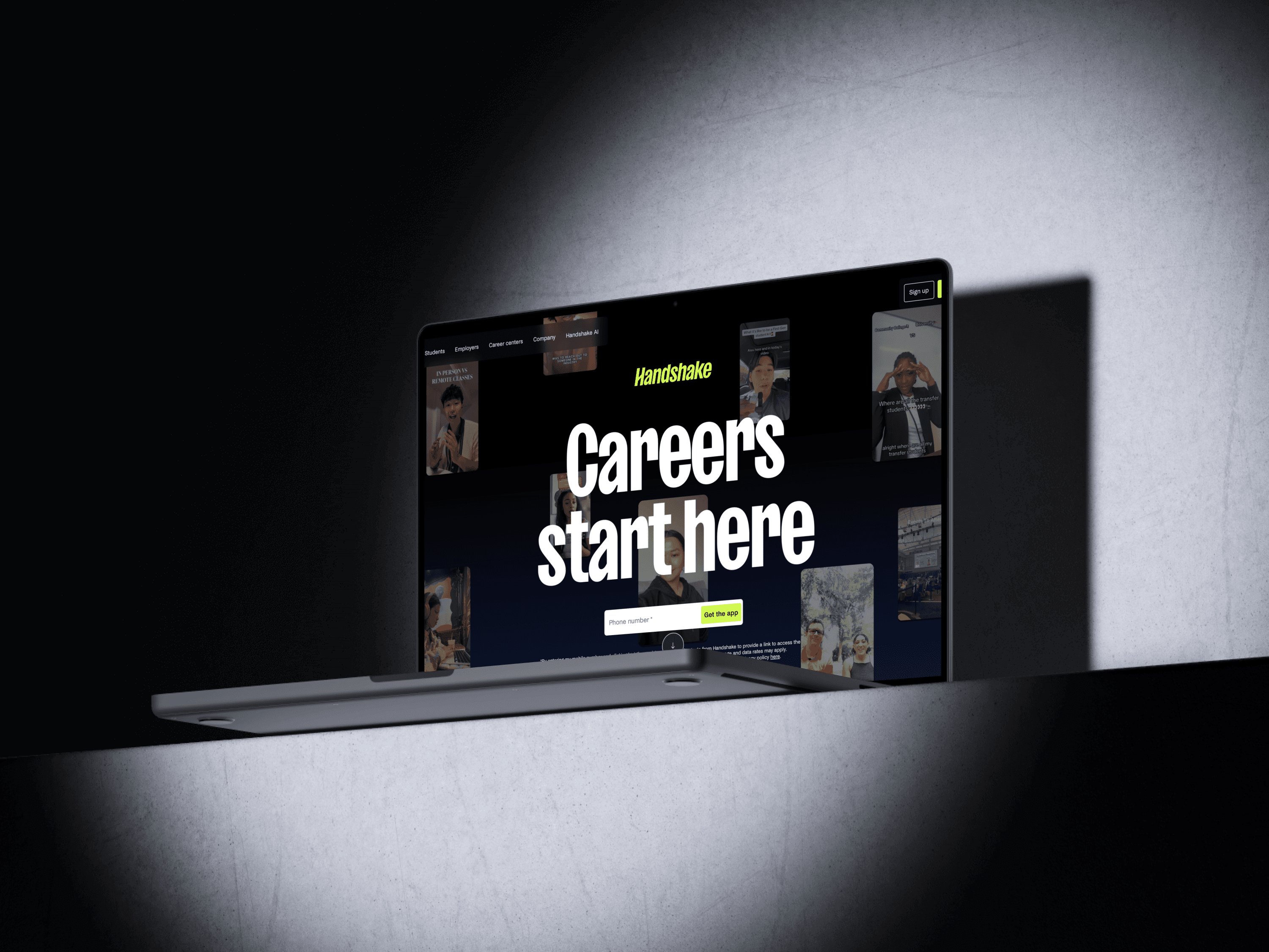
Handshake App
Enhancing Handshake's Job Search Experience
ROLE
UX Researcher
TIMELINE
10 Weeks
TEAM
4 UX graduate students
PLATFORM
Handshake Mobile Experience
METHOD
Contextual Inquiry
In-depth Interviews
Affinity Mapping
Experience Models
Prototyping
Remote Usability Testing
SCOPE
Mobile flows for Jobs, Profile, Networking, and Events.
8 participants
8 contextual inquiry sessions
4 experience models
3 personas
4 redesigned flows
4 usability tasks
[ 1 ]
Overview
[ Why Handshake, why contextual inquiry ]
Handshake is the primary platform Rutgers uses to connect students with internships, jobs, and career events. In theory, it should feel like a trusted, guided path into the job market. In practice, students around me described it as noisy, confusing, and secondary to LinkedIn and Indeed. For our Contextual Inquiry course, my team set out to understand how students actually use Handshake in their own environments and to redesign key flows so they could find relevant opportunities faster, feel clearer about eligibility, and use the platform with more confidence.
[ Context & Problem Space ]
[ What we focused on ]
Rather than redesigning “all of Handshake,” we scoped our work to four core student goals on mobile:
[ 2 ]
Research
[ Understanding real behavior ]
Our goal was to get past surface-level opinions and watch students use Handshake as they normally would: on their own phones, in their own spaces, with their own habits and shortcuts.
[ Research approach ]
We used contextual inquiry as our primary method. Each session combined:
a short interview about the student's job search history and tools
live observation of them using Handshake on their own device, often in their dorm room or study space
think-aloud navigation of core tasks like searching for jobs, editing their profile, checking messages, and browsing events
follow-up questions to clarify why they made certain choices or abandoned certain paths
We recorded sessions (with consent), captured detailed notes, and then synthesised the data using affinity mapping and several experience models.
63%
Feel overwhelmed on the Homepage
58%
Do not Understand job types
72 %
Lose track of applications
47 %
Abandon job listings due to confusion
[ Participants ]
We recruited a diverse sample of eight Rutgers students
[ Experience models ]
We created experience models to synthesise behavioural, contextual, and emotional data into a shared view of how students actually experience Handshake during their job search.

[ Key Insights ]
From our affinity diagramming and models, four themes emerged that directly shaped the redesign.
01
Profiles and onboarding feel high effort, low reward
Students described profile setup as “tedious” and “unclear.” They struggled to understand:
How complete their profile needed to be to affect recommendations
Where to add certifications or niche skills
How work authorization or visa status would influence job visibility
02
Job search is undermined by unreliable filters and vague cards
While the basic search model was intuitive, students repeatedly hit friction at two levels:
Filters that did not behave as expected, especially around remote roles and location combinations
Job cards that hid critical information, forcing extra clicks just to learn about salary, sponsorship, or location
03
Networking tools exist but do not feel purposeful
Handshake technically supports messaging and alumni networking, but:
Students struggled to distinguish authentic recruiters from spam
They could not easily share links or context when chatting
They had no sense of whether messages were seen or ignored
04
Events are valuable but hard to discover and evaluate
Students wanted to attend relevant career fairs and panels, but:
Event discovery was buried among other content
Filters were limited
“RSVP” terminology was confusing for some international students, who preferred “Register” and clearer descriptions of capacity and commitment
[ 3 ]
Design
[ From insights to solutions ]
Our synthesis work made it clear that we did not just need 'nicer screens.' We needed flows and structures that respected students' time, made eligibility and status obvious, and stitched jobs, networking, and events into one coherent experience.

[ Design principles]
1. Respect students' time
Help students qualify or reject opportunities at a glance, without unnecessary clicks.
2. Make eligibility and status unmistakable
Work authorisation, location, job type, and application state should never be guesswork.
3. Treat jobs, networking, and events as one journey
The interface should help students move smoothly between discovering roles, meeting people, and showing up at the right events.
4. Reduce cognitive load without oversimplifying
Support complex decisions with clear structure, not with more clutter or jargon.
[ Solution overview ]
We designed a mobile-first MVP that organises Handshake into four tabs: Jobs, Profile, Networking, and Events. Each tab directly responds to our research insights.
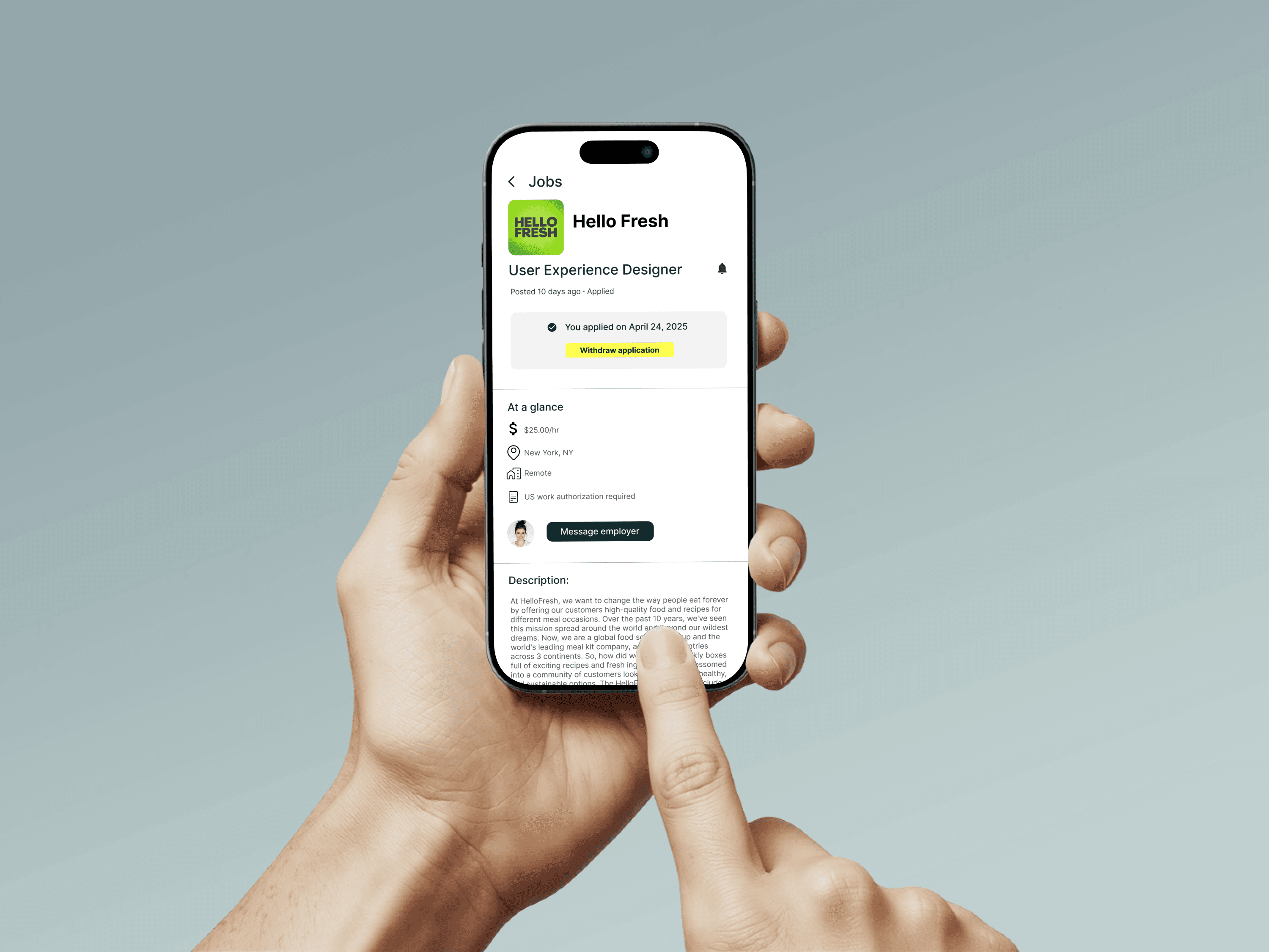
Jobs
Clearer filters and richer cards that foreground eligibility, location, and key details.
Profile
A more guided structure with better support for certifications, skills, and work authorisation.
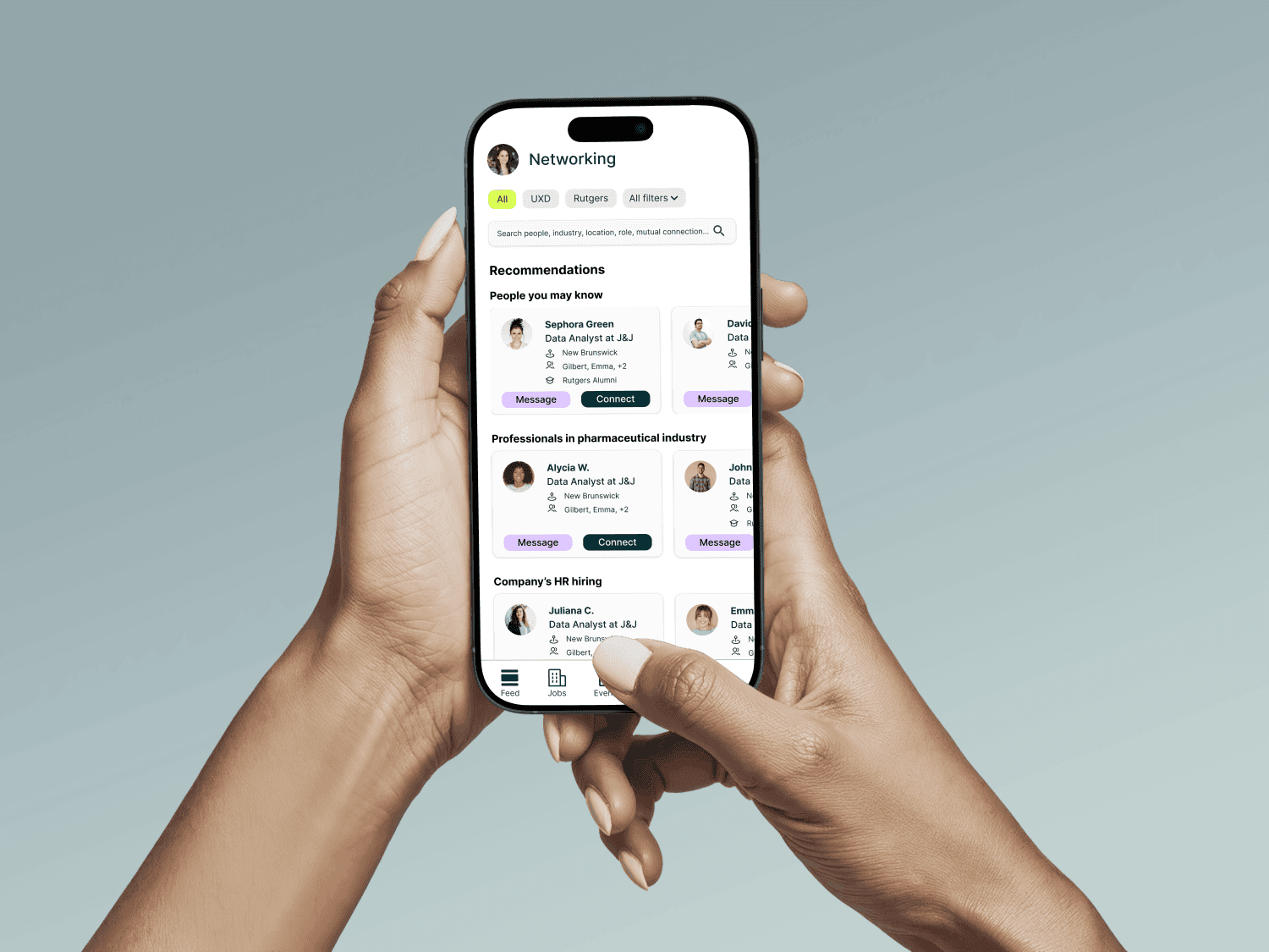
Networking
A focus on relevant alumni lists, contextual message prompts, and basic feedback like read indicators.
Events
More targeted discovery and transparent registration, including clearer labels and capacity information.

[ Key flows ]
We designed a mobile first MVP that organizes Handshake into four tabs: Jobs, Profile, Networking, and Events. Each tab directly responds to our research insights.
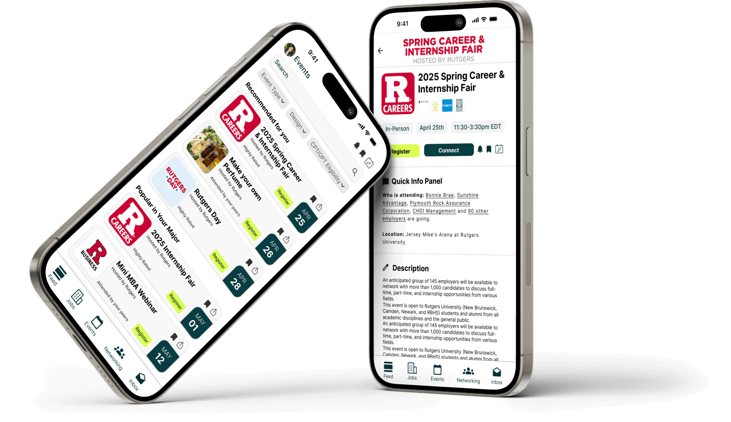
[ FLOW O1 ]
Searching and filtering jobs
[ BEFORE ]
Before, students struggled with filters that did not behave as expected, especially when combining remote and location filters. Job cards often hid crucial information like work authorisation or job type until the detail view, which led to repeated dead ends.
[ AFTER ]
In the redesign, filters are simplified and their current state is spelled out in plain language at the top of the results. Job cards pull essential information forward: job type, location or remote, salary range (when available), and any work authorization notes. A subtle "match fit" indicator communicates how well the role aligns with the student's profile, encouraging them to keep their data up to date.
[ FLOW O2 ]
Messaging and networking with alumni
[ BEFORE ]
Students liked the idea of reaching out to alumni but did not feel confident using Handshake to do it. They were unsure who they were actually talking to, whether messages were seen, and how to share useful context.
[ AFTER ]
We shifted the networking experience towards a curated alumni list with clear labels: role, company, graduation year, and shared attributes like major or clubs. Message prompts give students a starting point that feels more professional than a blank box, and basic read indicators close the loop so outreach does not feel like shouting into the void. The goal is not to replicate LinkedIn, but to make Handshake a credible first touchpoint.
[ FLOW O3 ]
Discovering and registering for events
[ BEFORE ]
Students valued events but often discovered them late or not at all. The events area was harder to find, filters were minimal, and the "RSVP" label confused some students about the level of commitment.
[ AFTER ]
Events in the redesign can be filtered by topic, format, and location, and live alongside a clear search. The primary action is "Register," supported by capacity indicators and an "Add to calendar" option. Cards describe what students can expect from the event, not just who is hosting it, so the decision to attend feels more informed.
[ 4 ]
Testing
[ Validating the redesign ]
To understand how our redesigned flows behaved in practice, we conducted a small remote usability test with a clickable Figma prototype.
[ Test setup ]
We ran sessions with three students who matched our target profiles. Each participant completed four tasks:
1.Find career advice from other students or the career centre in the app.
2.Find and message a relevant alumni.
3.Find and apply to a remote internship that fits their interests.
4.Find and register for a career fair event.
We measured task success, perceived ease, and observed where people hesitated or improvised workarounds.
What worked
Networking: participants quickly understood the alumni list and felt more confident about who they were contacting.
Events: the "Register" label and capacity information made the event flow feel straightforward and trustworthy.
Layout: participants appreciated cleaner, card-based layouts with key information surfaced early.
What didn't work
Feed and advice: one participant struggled to find career advice in the redesigned feed, which suggested our information architecture for content still needs refinement.
Filter reliability: a technical bug in the prototype caused filters to behave inconsistently, reinforcing how critical robust filter behavior is for trust.
Terminology edge cases: while "Register" tested better than "RSVP," we still saw opportunities to clarify the relationship between registration and attendance.

[ Iterations ]
Based on these findings, we:
made the advice and resources sections more explicit instead of burying them in a generic feed
clarified filter states and emphasised filter reliability in our recommendations to the product team
committed to "Register" as the primary events label and added clearer microcopy about what registration means

[ 5 ]
Impact
[ User Impact ]
100%
Event registration success rate
67%
Alumni networking task completion
33→100%
Career advice discoverability improvement
[ What I Learned ]
Trust has measurable consequences
When filters failed or information was unclear, task success dropped immediately. Reliability proved more important than feature depth.
Ease matters as much as completion
High task success paired with low ease still felt like failure. Designing for confidence changed how success was evaluated.
Metrics don’t need shipping to be meaningful
Even without launch data, task success, ease scores, and failure rates provided concrete signals for prioritisation.
[ Next steps ]
Broaden validation
Test the redesigned flows with a larger, more diverse student population, with particular focus on international and first-generation students.
Assess feasibility
Partner with career services and Handshake’s product team to evaluate technical constraints and integration considerations.
Measure impact
Instrument key flows to track application follow-through, time-to-find, and sustained engagement.

[ Prototype]
READY TO TURN FICTION INTO FLOW?Let's Collaborate
Tell me about your idea, your vision, or just say hi.